Warning: Removed 2 rows containing missing values or values outside the scale range
(`geom_point()`).
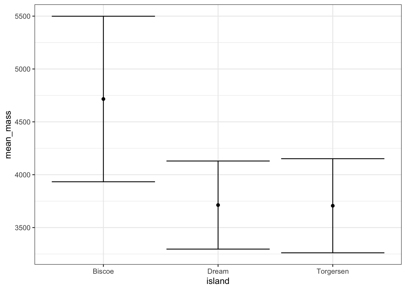
What geom can we use for error bars? Type geom_ and hit tab to see a list of all possible geom_ functions. geom_errorbar() sounds about right! What data do we need to plot an error bar? View the help file with ?geom_errorbar and check the “Aesthetics” section. Looks like we need x (island), ymin, and ymax.
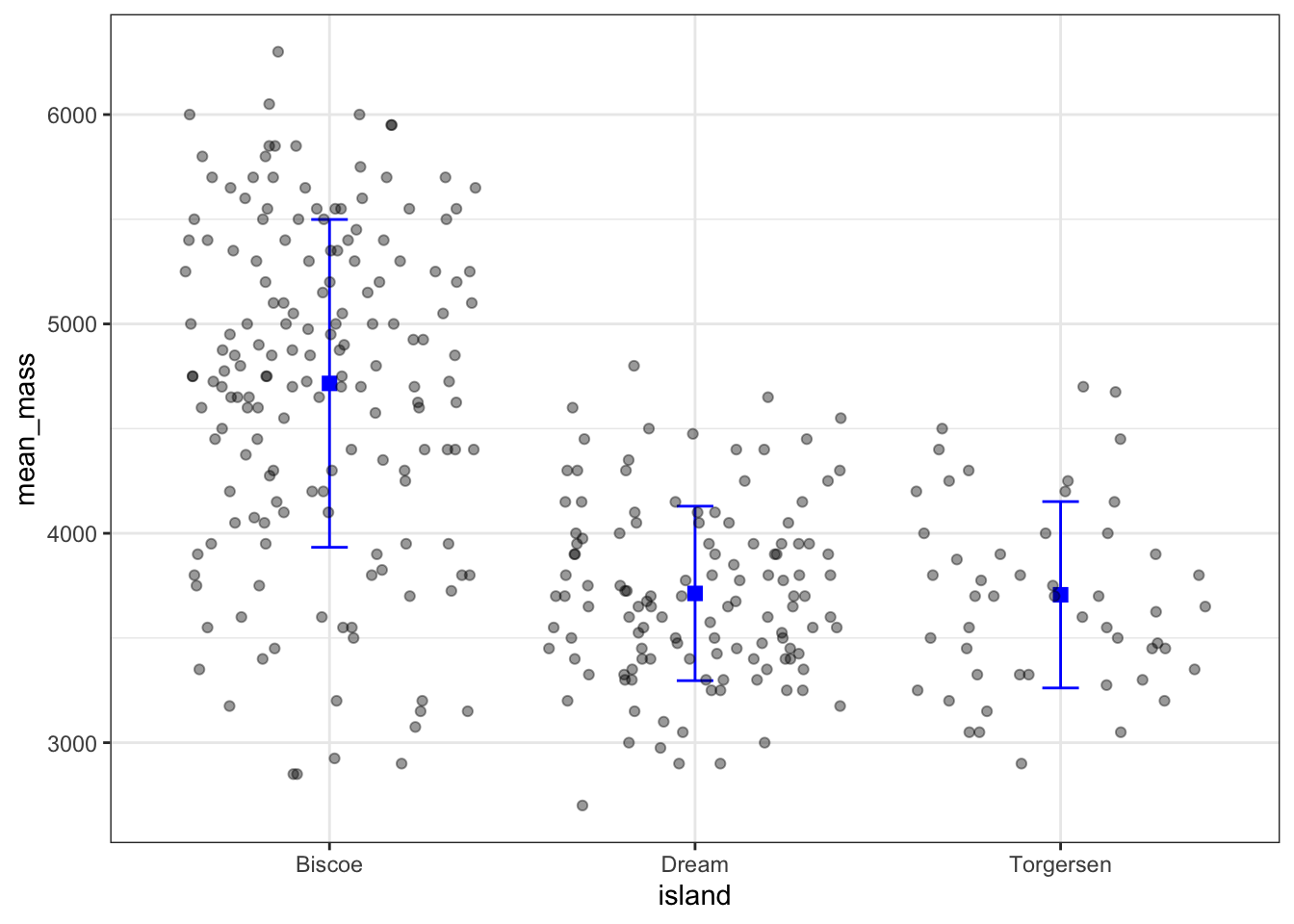
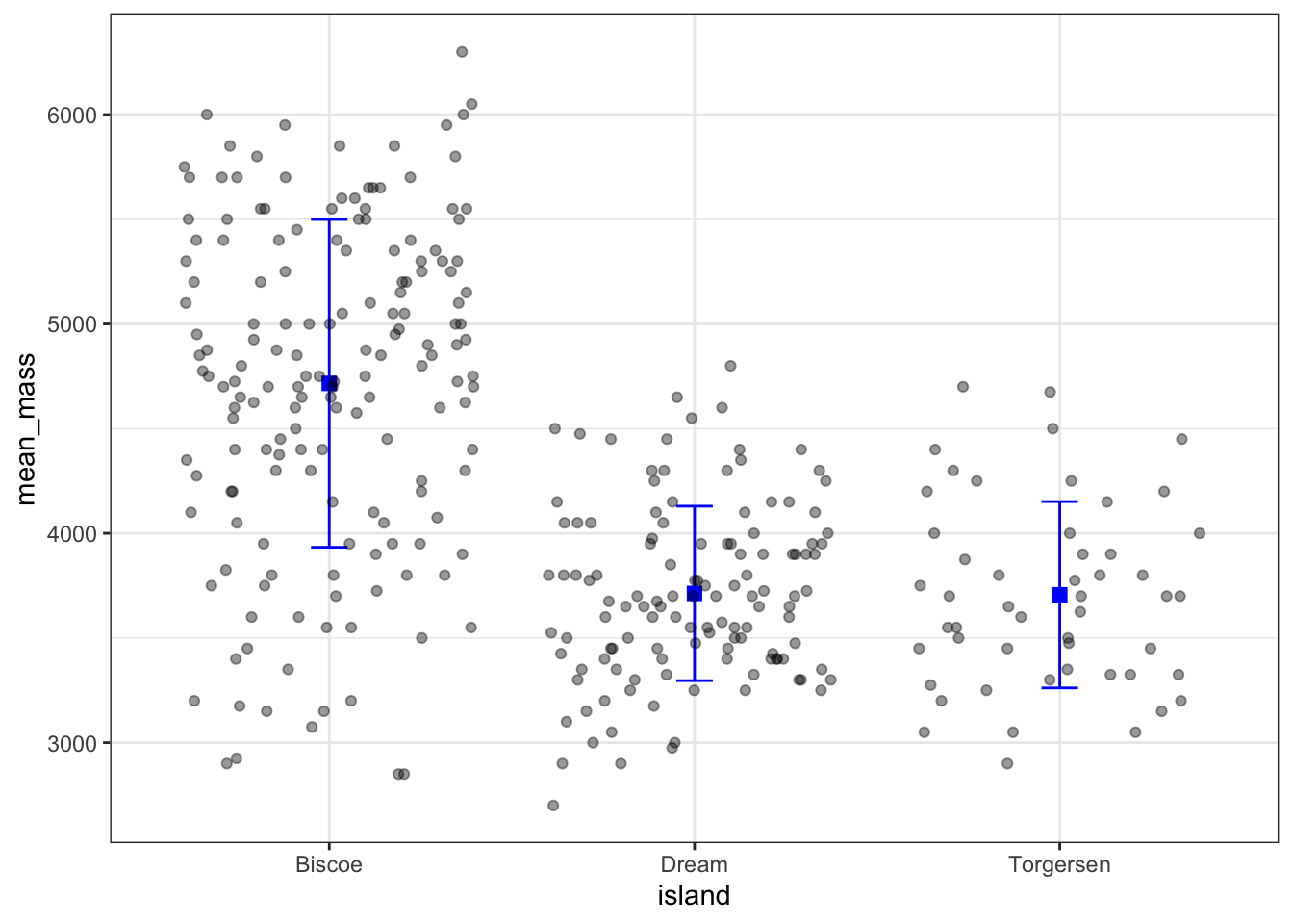
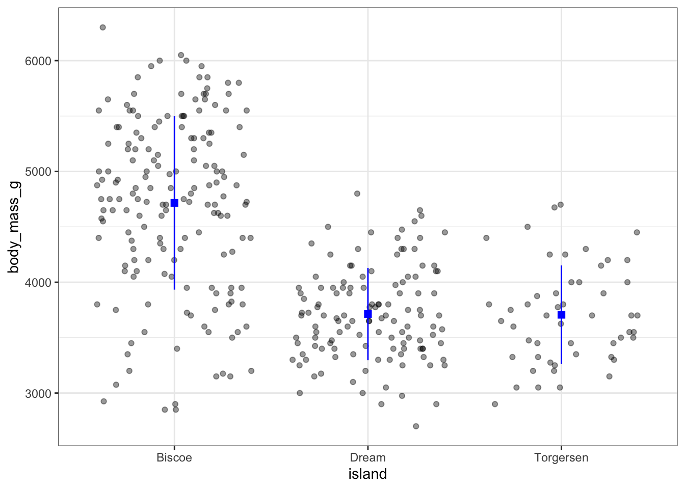
Let’s start by summarizing the data to calculate a mean and standard deviation for each island.
Let’s do some tweaking to make this look more appealing
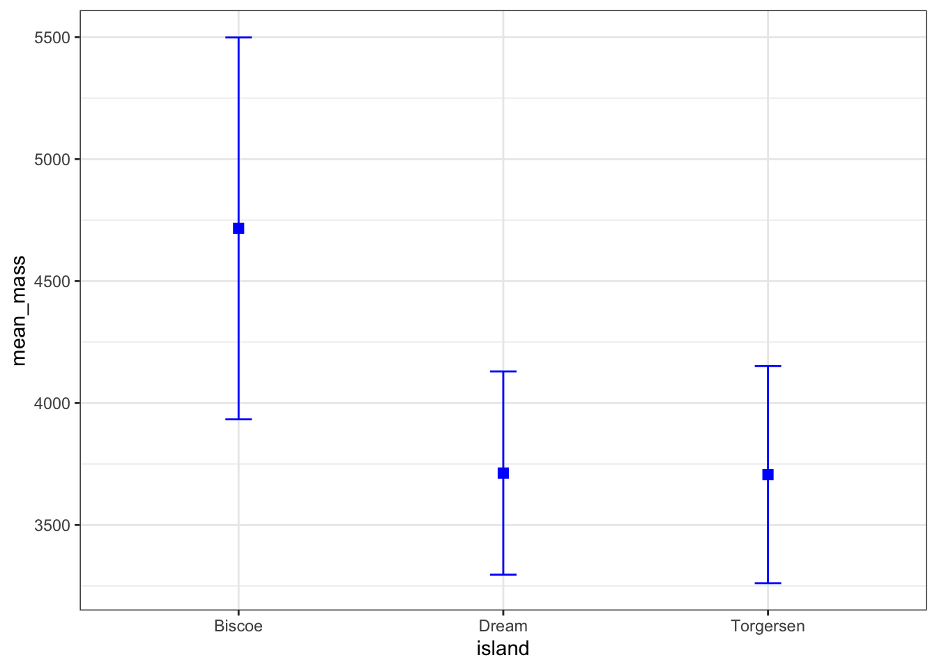
ggplot(peng_summary, aes(x =island))+#mean:geom_point(aes(y =mean_mass), shape ="square", color ="blue", size =2.5)+#sd:geom_errorbar( data =peng_summary,aes(ymin =lower, ymax =upper), width =0.1, color ="blue")
Now we can add the raw data using geom_jitter() by overriding the data argument.
ggplot(peng_summary, aes(x =island))+#mean:geom_point(aes(y =mean_mass), shape ="square", color ="blue", size =2.5)+#sd:geom_errorbar( data =peng_summary,aes(ymin =lower, ymax =upper), width =0.1, color ="blue")+#add raw data:geom_jitter( data =penguins, #override data to use penguins instead of peng_summaryaes(y =body_mass_g),)
Warning: Removed 2 rows containing missing values or values outside the scale range
(`geom_point()`).
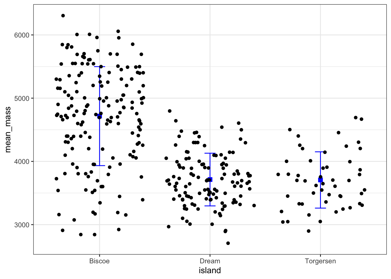
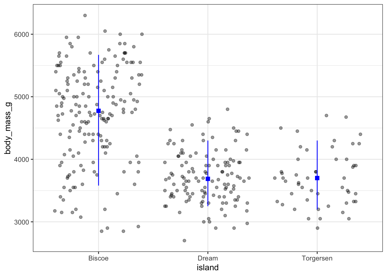
And finally we can do some tweaking of the jitter layer
ggplot(peng_summary, aes(x =island))+#mean:geom_point(aes(y =mean_mass), shape ="square", color ="blue", size =2.5)+#sd:geom_errorbar( data =peng_summary,aes(ymin =lower, ymax =upper), width =0.1, color ="blue")+#add raw data:geom_jitter( data =penguins, #override data to use penguins instead of peng_summaryaes(y =body_mass_g), alpha =0.4, #add transparency height =0#don't jitter vertically, only horizontally)
Warning: Removed 2 rows containing missing values or values outside the scale range
(`geom_point()`).
Aesthetics
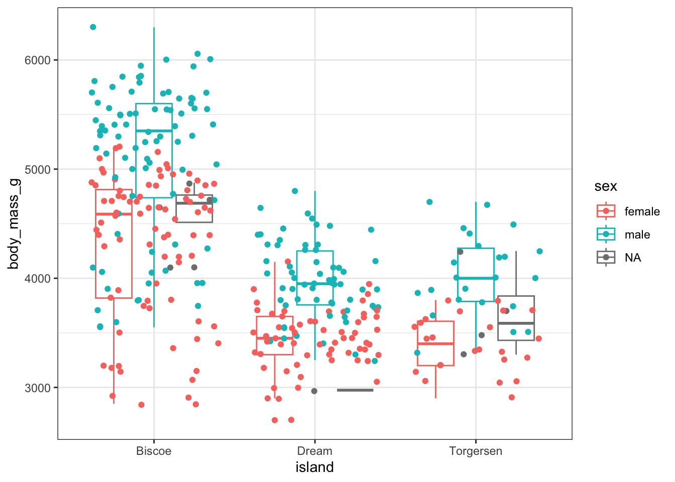
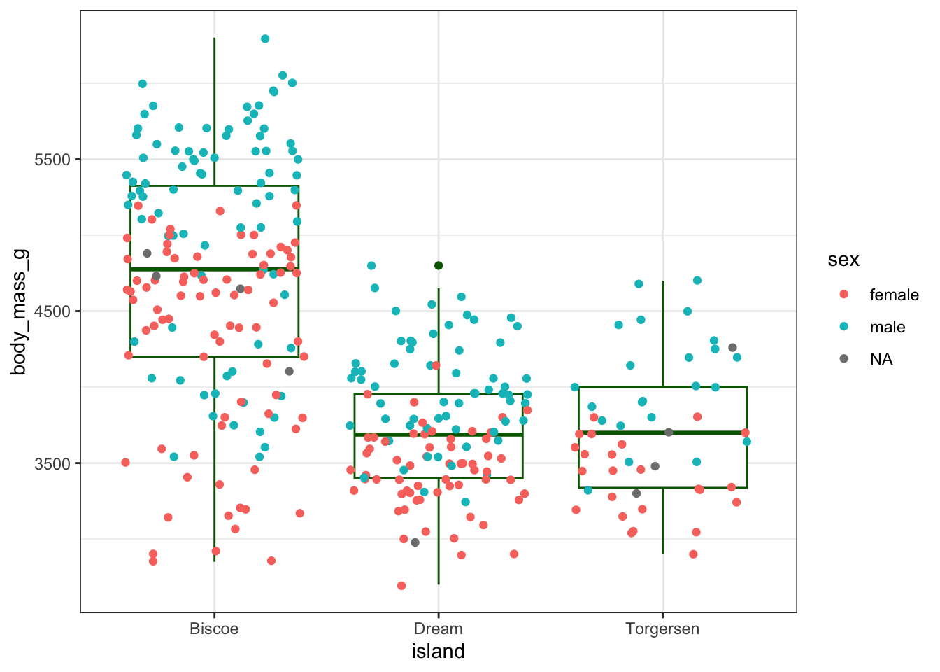
Let’s use a boxplot on top of the jitter plot and have the points colored by sex but not the box plots
When color = sex is in the aes() call in ggplot(), this aesthetic mapping is inherited by all geoms.
ggplot(penguins, aes(x =island, y =body_mass_g, color =sex))+geom_boxplot()+geom_jitter()
Warning: Removed 2 rows containing non-finite outside the scale range
(`stat_boxplot()`).
Warning: Removed 2 rows containing missing values or values outside the scale range
(`geom_point()`).
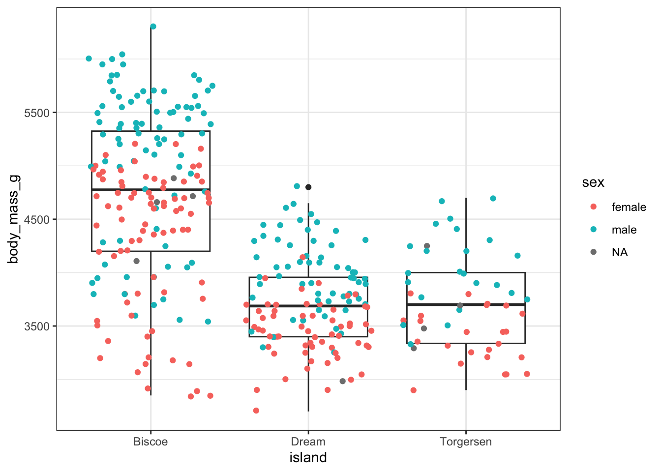
If we want to map sex to color only for the jitter layer, we can remove it from ggplot() and add it to geom_jitter()
ggplot(penguins, aes(x =island, y =body_mass_g))+geom_boxplot()+geom_jitter(aes(color =sex))
Warning: Removed 2 rows containing non-finite outside the scale range
(`stat_boxplot()`).
Warning: Removed 2 rows containing missing values or values outside the scale range
(`geom_point()`).
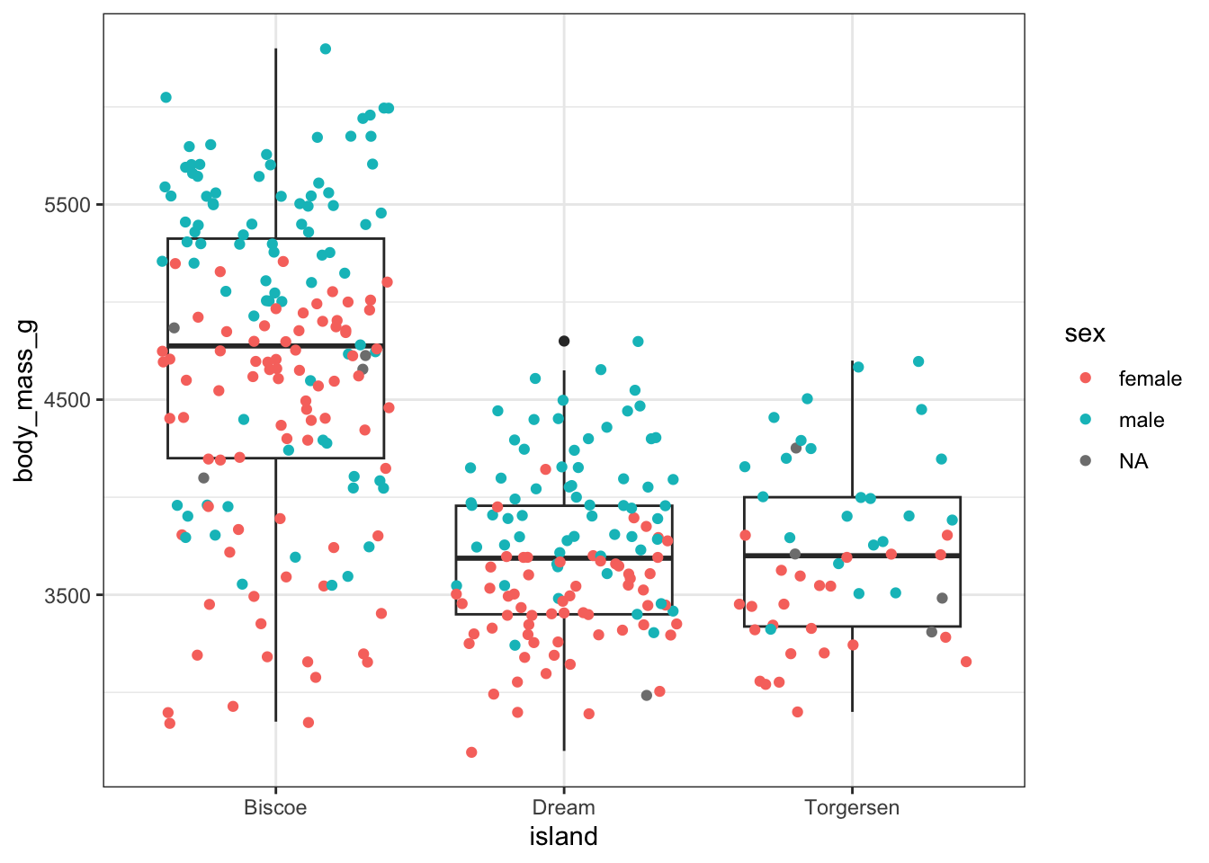
Or, we can use inherit.aes = FALSE and specify all the aesthetic mappings for the boxplot layer.
ggplot(penguins, aes(x =island, y =body_mass_g, color =sex))+geom_boxplot(aes(x =island, y =body_mass_g), inherit.aes =FALSE)+geom_jitter()
Warning: Removed 2 rows containing non-finite outside the scale range
(`stat_boxplot()`).
Warning: Removed 2 rows containing missing values or values outside the scale range
(`geom_point()`).
If you set aesthetic mappings to constants, it overrides the mappings to data.
ggplot(penguins, aes(x =island, y =body_mass_g, color =sex))+geom_boxplot(color ="darkgreen")+geom_jitter()
Warning: Removed 2 rows containing non-finite outside the scale range
(`stat_boxplot()`).
Warning: Removed 2 rows containing missing values or values outside the scale range
(`geom_point()`).
Scales
Here’s the original plot, saved as p
`geom_smooth()` using formula = 'y ~ x'
And here’s what it’s going to end up like after modifying scales:
`geom_smooth()` using formula = 'y ~ x'
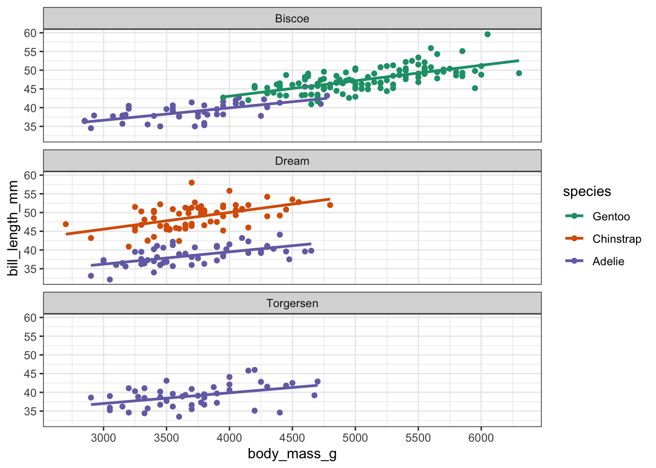
First, let’s address the color scale. Two changes need to happen: custom colors, and a re-ordering of the species in the legend. scale_color_manual() can take care of both.
We can supply whatever colors we want with a named vector where the names correspond to levels of the species variable that is mapped to color.
These are hex-codes, but you can also used named colors in R.
Supply that named vector to the values argument.
p+scale_color_manual( name ="Species", values =my_cols)
`geom_smooth()` using formula = 'y ~ x'
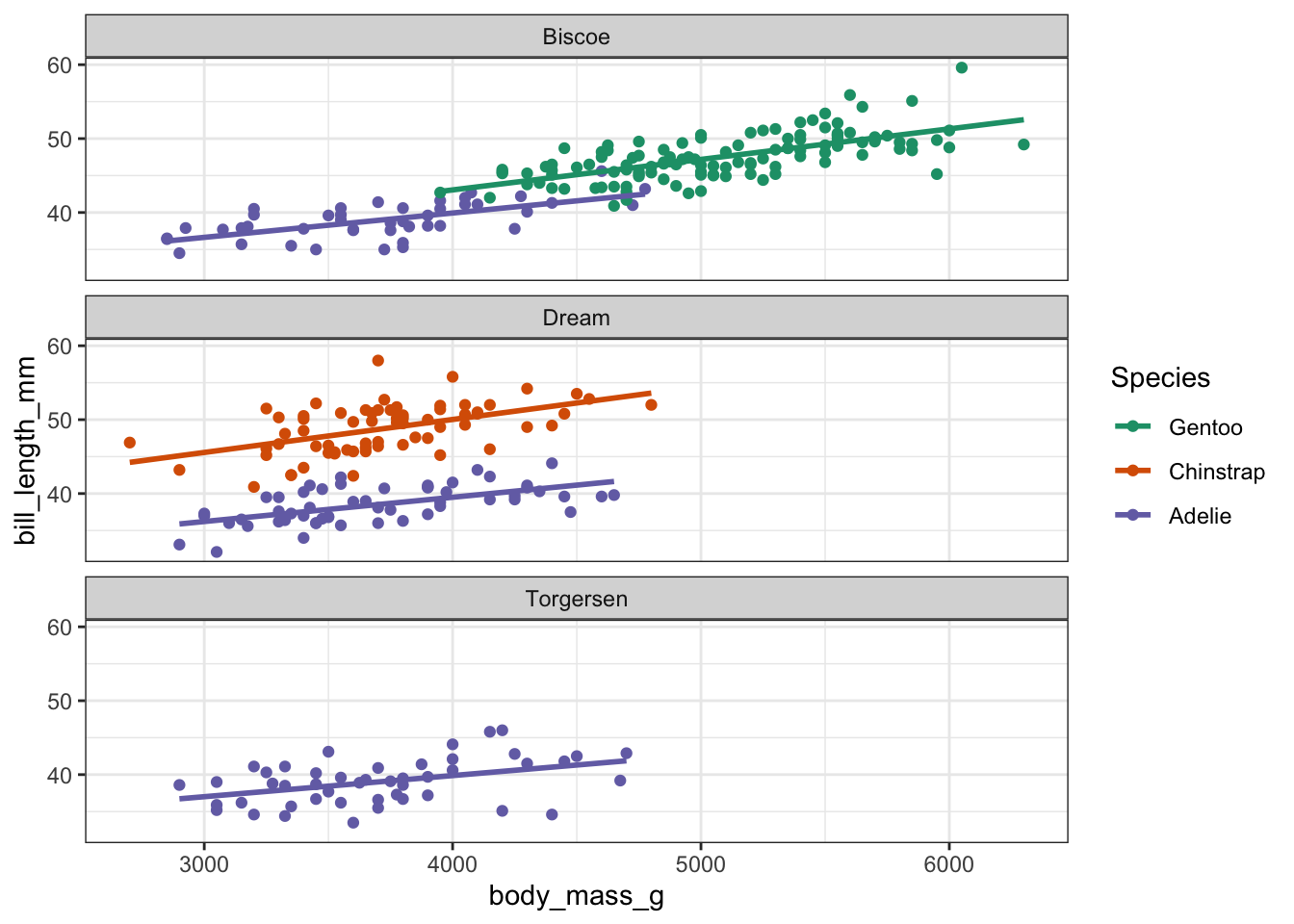
The re-ordering happens with the breaks argument like so:
p_new<-p+scale_color_manual( name ="Species", values =my_cols, breaks =c("Gentoo", "Chinstrap", "Adelie"))p_new
`geom_smooth()` using formula = 'y ~ x'
Now we can move on to the x and y axes. For the x-axis, let’s increase the number of breaks to about 10.
p_new+scale_x_continuous(n.breaks =10)
`geom_smooth()` using formula = 'y ~ x'
And we can supply exact breaks to the y-axis.
p_new+scale_x_continuous(n.breaks =10)+scale_y_continuous(breaks =seq(from =30, to =65, by =5.5))
`geom_smooth()` using formula = 'y ~ x'
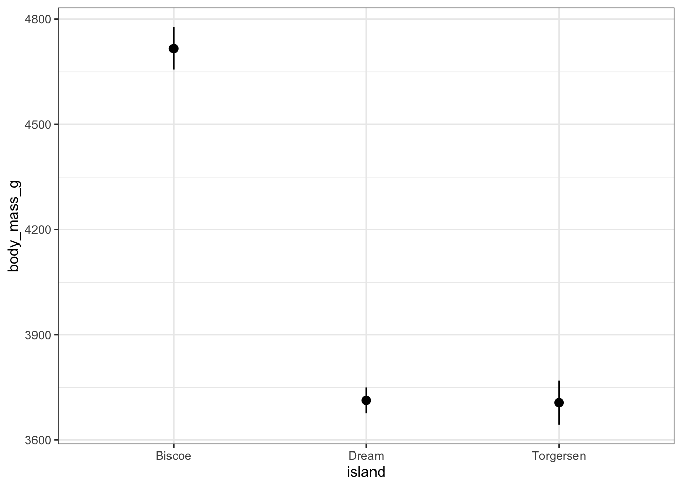
ggplot(penguins, aes(x =island, y =body_mass_g))+geom_jitter(alpha =0.4, height =0)+stat_summary(fun.data =mean_sdl, fun.args =list(mult =1), color ="blue", shape ="square")
Warning: Removed 2 rows containing non-finite outside the scale range
(`stat_summary()`).
Warning: Removed 2 rows containing missing values or values outside the scale range
(`geom_point()`).
Geoms
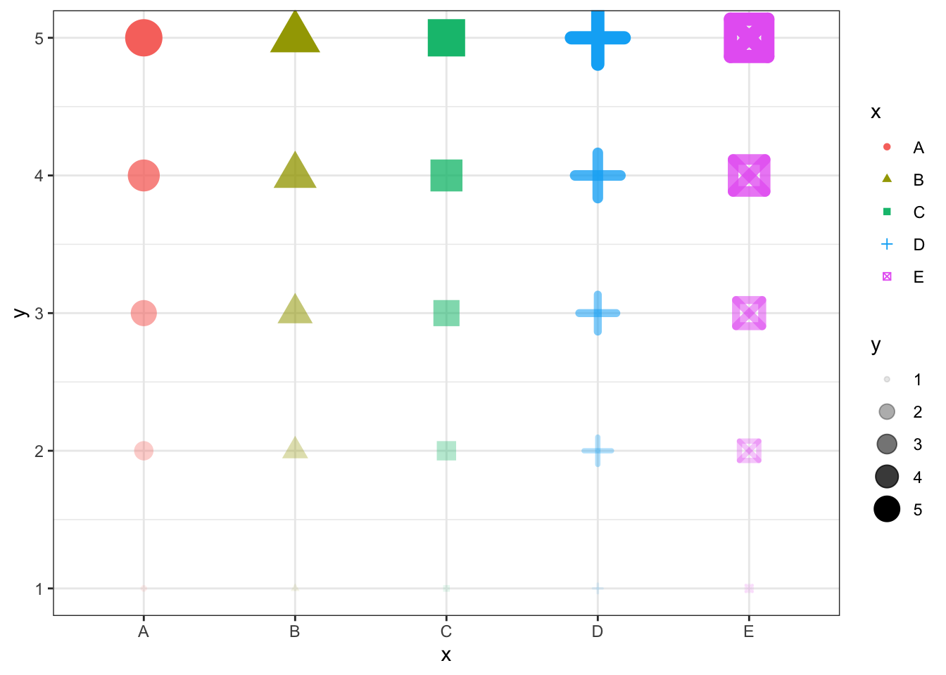
df<-expand_grid(x =LETTERS[1:5], y =1:5)ggplot(df)+geom_point(aes(x =x, y =y, color =x, shape =x, size =y, alpha =y, stroke =y))
Stats
stat_summary()
stat_summary() calculates some summary statistics as y, ymin, and ymax (and possibly other aesthetic mappings) and supplies them to a geom (default = “pointrange”). This is a shortcut for doing the sort of plot we did in the “Data” section without having to create a separate dataset.
First, let’s see what the default looks like:
ggplot(penguins, aes(x =island, y =body_mass_g))+stat_summary()
Warning: Removed 2 rows containing non-finite outside the scale range
(`stat_summary()`).
No summary function supplied, defaulting to `mean_se()`
As you can see in the warning, by default it is plotting mean ± SE (standard error) with the mean_se() function. To instead plot mean ± SD we can either create our own function or use mean_sdl() and change it’s mult argument from the default 2 which doubles the SD.
It creates a tibble with the columns y, ymin, and ymax. Any function that does this will work with stat_summary() by supplying it to the fun.data argument. To pass along the mult argument, we have to use the fun.args argument.
ggplot(penguins, aes(x =island, y =body_mass_g))+stat_summary(fun.data =mean_sdl, fun.args =list(mult =1))
Warning: Removed 2 rows containing non-finite outside the scale range
(`stat_summary()`).
Now we can add our data!
ggplot(penguins, aes(x =island, y =body_mass_g))+geom_jitter(alpha =0.4, height =0)+stat_summary(fun.data ="mean_sdl", fun.args =list(mult =1), color ="blue", shape ="square")
Warning: Removed 2 rows containing non-finite outside the scale range
(`stat_summary()`).
Warning: Removed 2 rows containing missing values or values outside the scale range
(`geom_point()`).
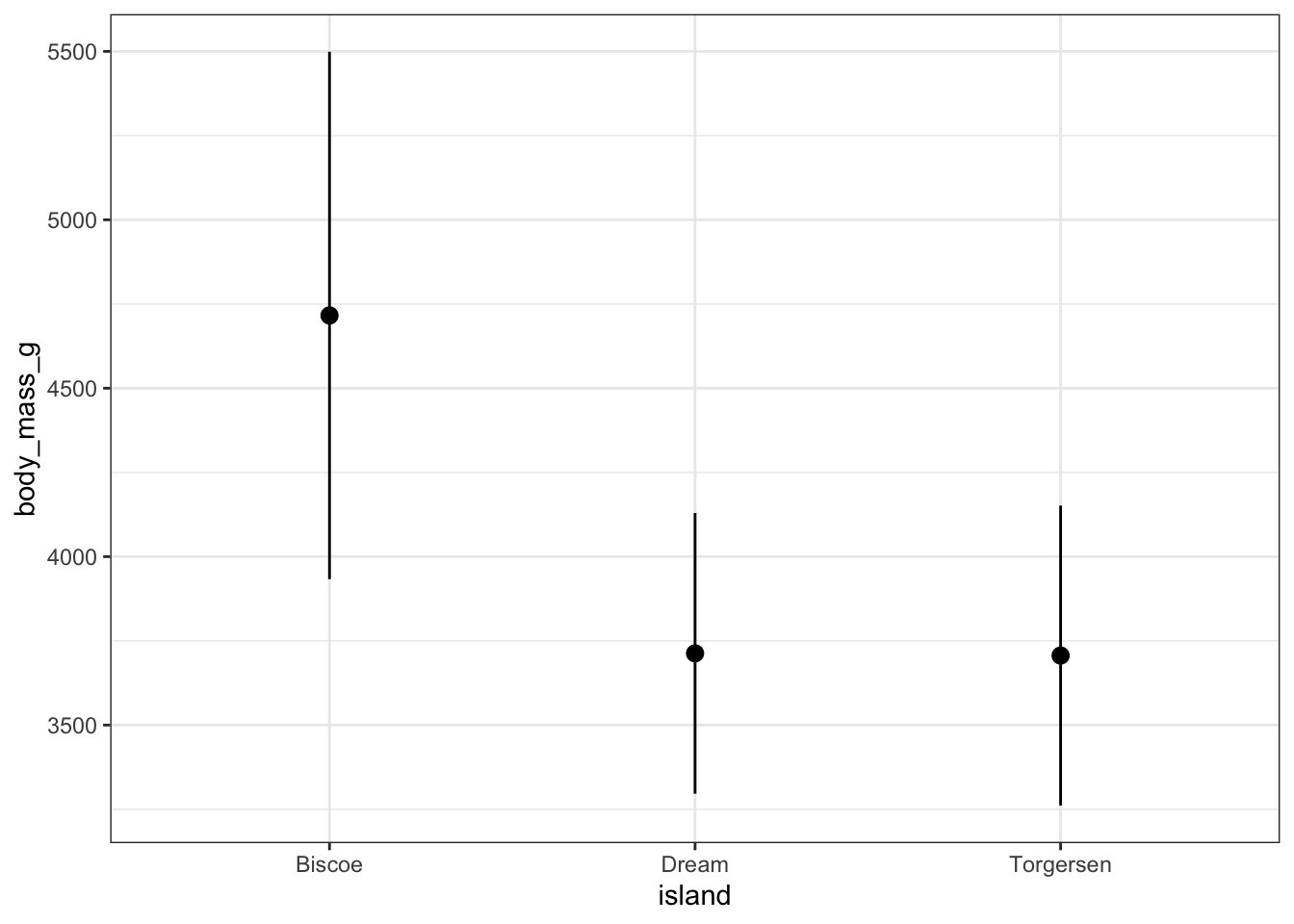
We could instead use our own custom function that plots the median and the middle 80% of data points, for example.
Warning: Removed 2 rows containing non-finite outside the scale range
(`stat_summary()`).
Warning: Removed 2 rows containing missing values or values outside the scale range
(`geom_point()`).
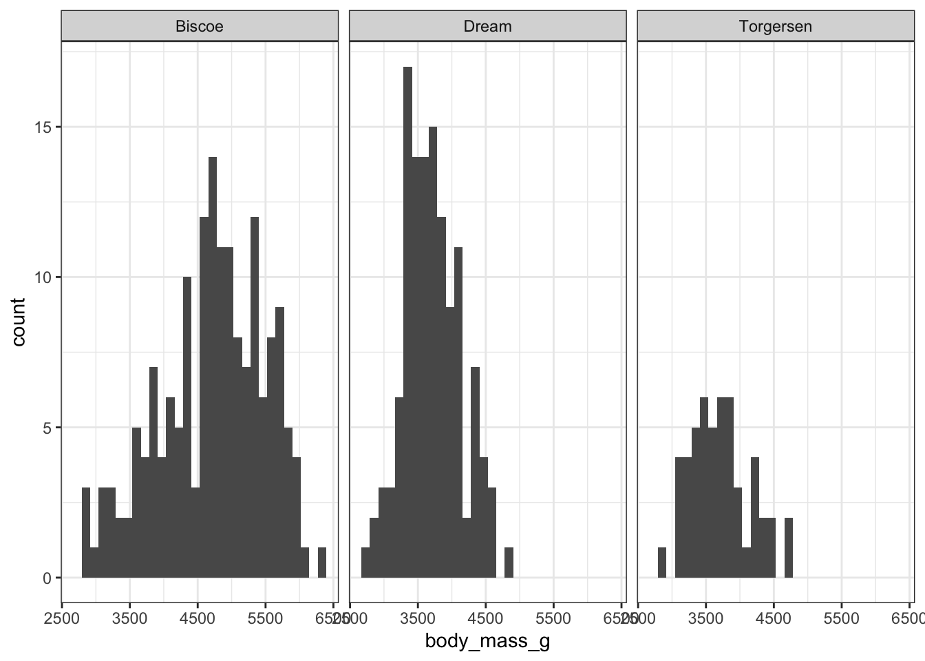
Binned density plot with geom_histogram() and after_stat()
Some “stats” calculate multiple values available with after_stat(). For example, geom_histogram() uses the count variable calculated by stat_bin() to plot the number of data points in each bit on the y-axis.
Here’s a histogram of body mass faceted by island:
`stat_bin()` using `bins = 30`. Pick better value with `binwidth`.
Warning: Removed 2 rows containing non-finite outside the scale range
(`stat_bin()`).
Torgersen island clearly just has fewer penguins, making it somewhat difficult to compare the relative distribution of body mass among the islands.
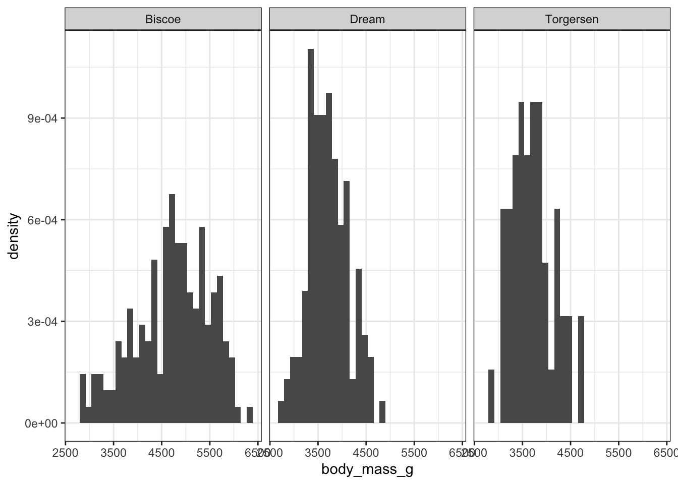
In the “Computed variables” section of ?stat_bin() you see that it also calculates density, ncount, ndensity, and width. We can plot density of points rather than count using after_stat(density).
ggplot(penguins)+geom_histogram(aes(x =body_mass_g, y =after_stat(density)))+facet_wrap(vars(island))
`stat_bin()` using `bins = 30`. Pick better value with `binwidth`.
Warning: Removed 2 rows containing non-finite outside the scale range
(`stat_bin()`).
Now the bars for each island add up to 1, taking sample size out of the equation.
Facets
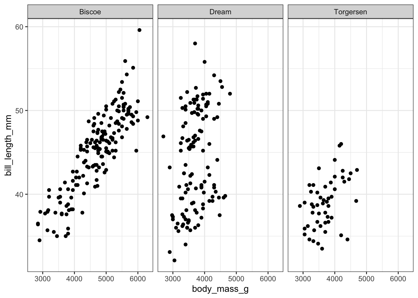
facet_wrap() facets by a single variable
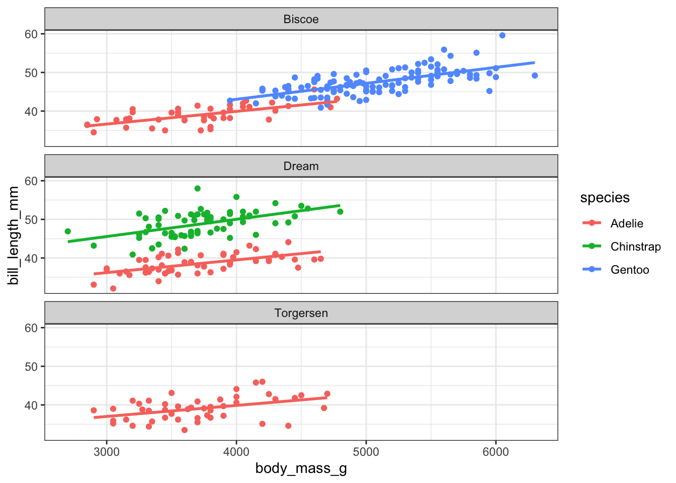
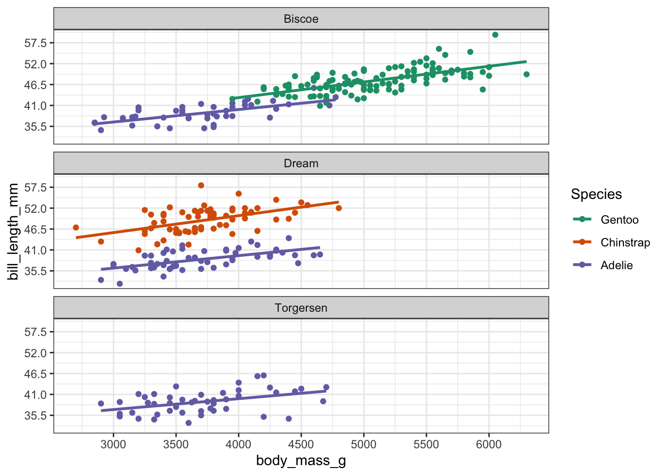
ggplot(penguins, aes(x =body_mass_g, y =bill_length_mm))+facet_wrap(vars(island))+geom_point()
Warning: Removed 2 rows containing missing values or values outside the scale range
(`geom_point()`).
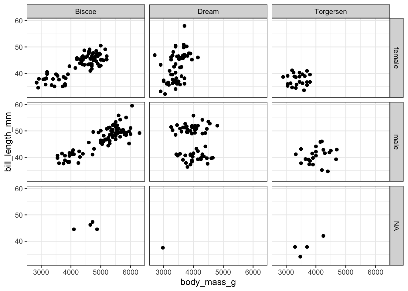
facet_grid() facets by two variables
ggplot(penguins, aes(x =body_mass_g, y =bill_length_mm))+facet_grid(vars(sex), vars(island))+geom_point()
Warning: Removed 2 rows containing missing values or values outside the scale range
(`geom_point()`).
Coords
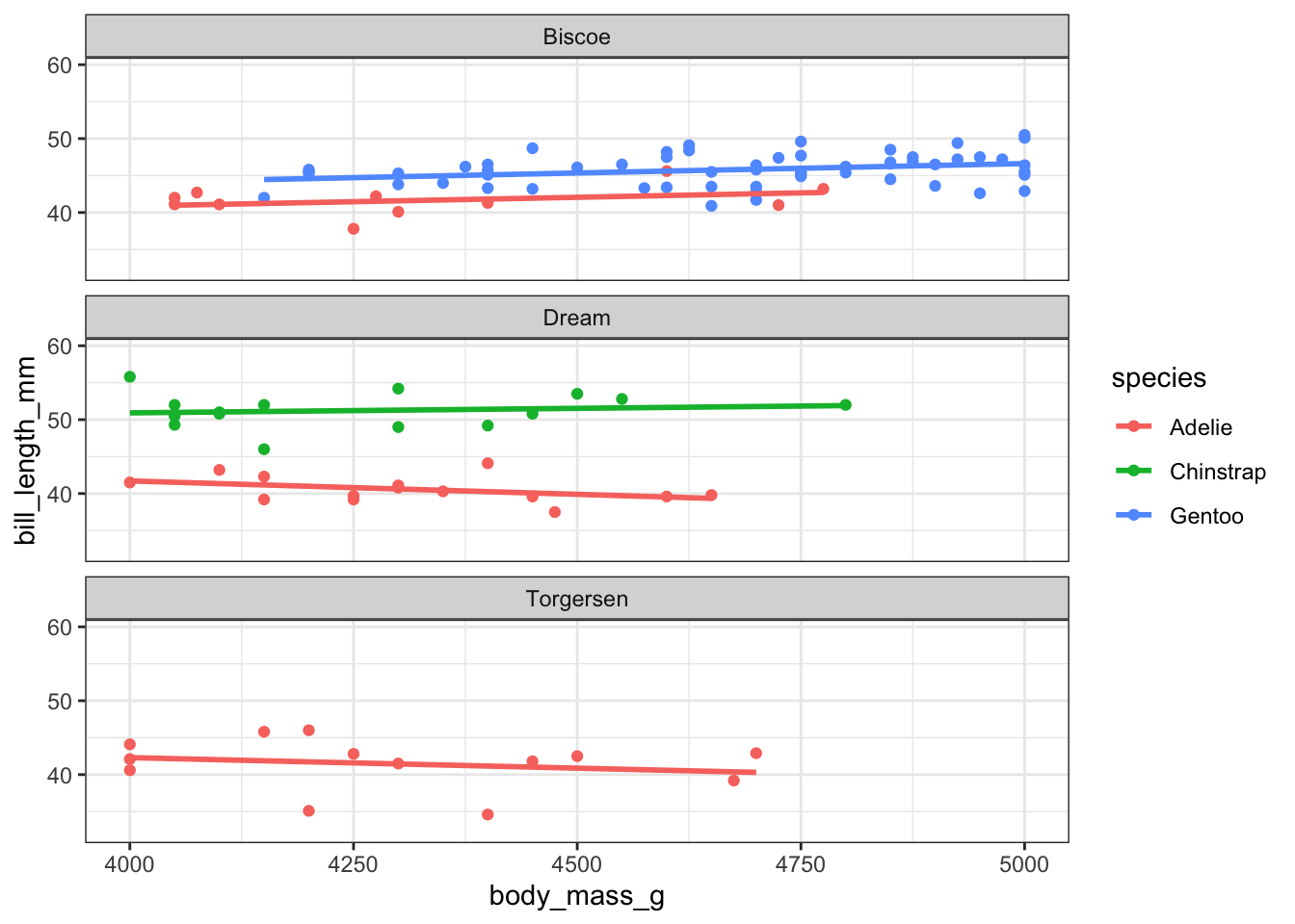
There are multiple ways to change the axis limits in ggplot2. First, you can change them with scale_x_continuous() or scale_y_continuous()
Warning: Removed 222 rows containing non-finite outside the scale range
(`stat_smooth()`).
Warning: Removed 222 rows containing missing values or values outside the scale range
(`geom_point()`).
You can see in the warning message printed that 222 rows have been removed before drawing this plot. You can tell because the trend lines produced by geom_smooth() now have different slopes because they are fit to only a subset of data!
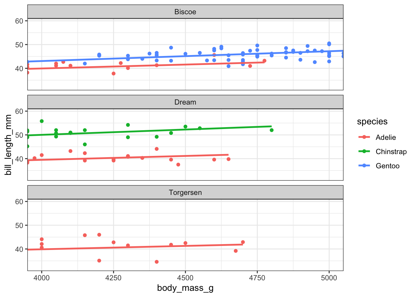
You can also change the limits with coord_cartesian()
This has the effect of zooming in on the x-axis. The lines and points just outside of the limits are cut off and the slopes of the trend lines are unaffected because no data has been removed.