Foundations of {ggplot2}
2024-06-06
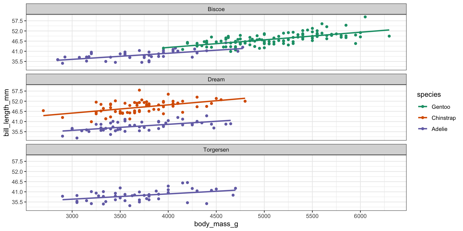
Data
Observations and variables to be visualized.
What data is being visualized?
Body mass measured in grams
Bill length measured in mm
Island and species categories

Aesthetics
Visual elements (color, shape, position, size, etc.) used to encode data.
What aesthetics are used to encode these data?
Color
x position
y position

Scales (and guides)
Scales translate data units into visual units, guides translate visual units back to data units.
What scales are used?
- Continuous and linear x and y axes (scales)
- Discrete (categorical) color scale

Geometric Objects (“geoms”)
Objects, often having multiple aesthetics, that represent data visually.
What geometric objects are used?
- Data is represented using circles/points
- Trend is represented as a line

Statistics (“stats”)
Any calculations or transformations applied to the data in order to plot it.
What “stats” are used?
For points, none (stat = “identity”)
For trend lines, linear regression

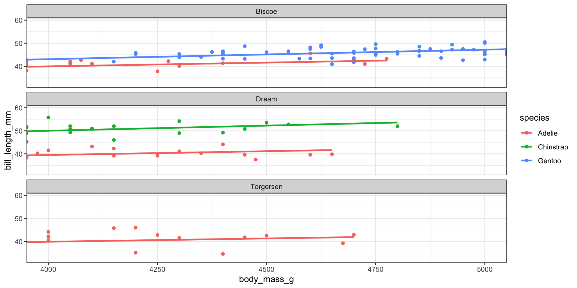
Facets
Plots can be split into small multiples or “facets” by a variable.
What is the faceting variable?
- Faceted by island

Coordinate System
How spatial positions are represented on paper (or screen)—e.g. map projections.
What coordinate system is used?
- Cartesian coordinates

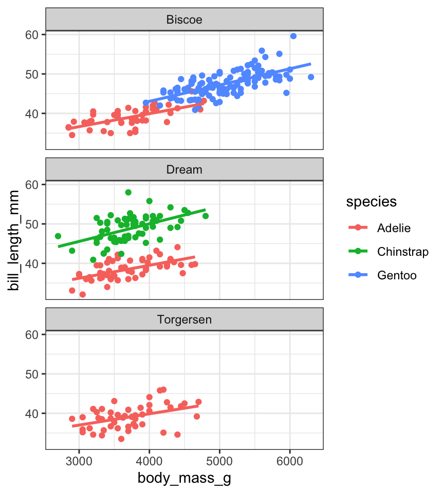
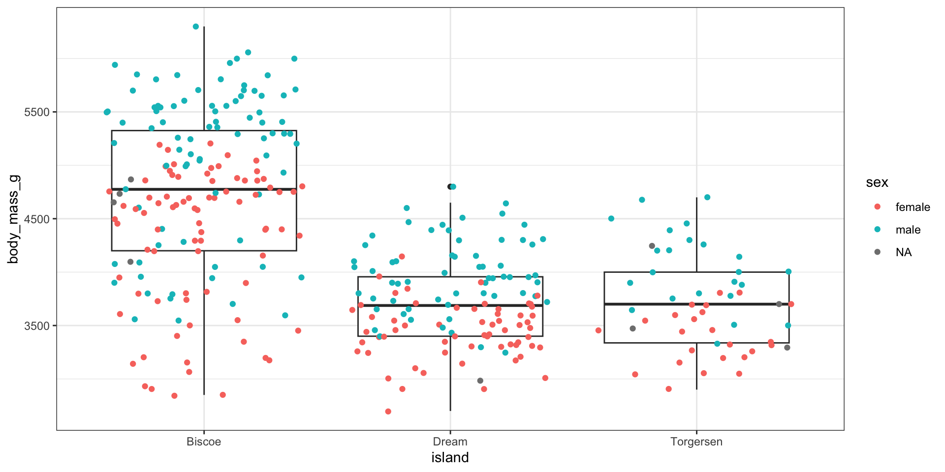
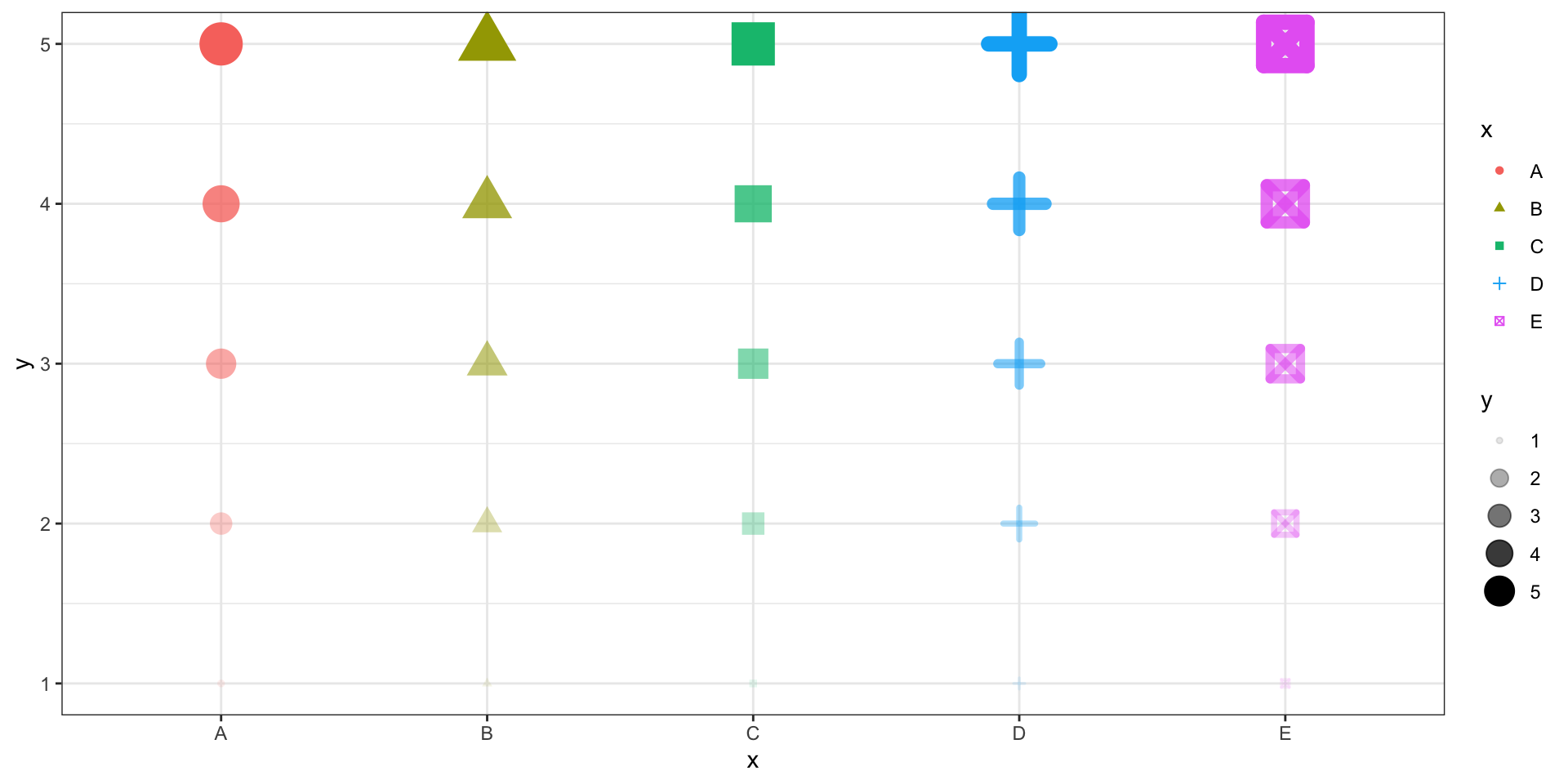
Practice
Identify each of the seven components of this plot
- Data
- Aesthetics
- Scales
- Geometric Objects
- Statistics
- Facets
- Coordinate System
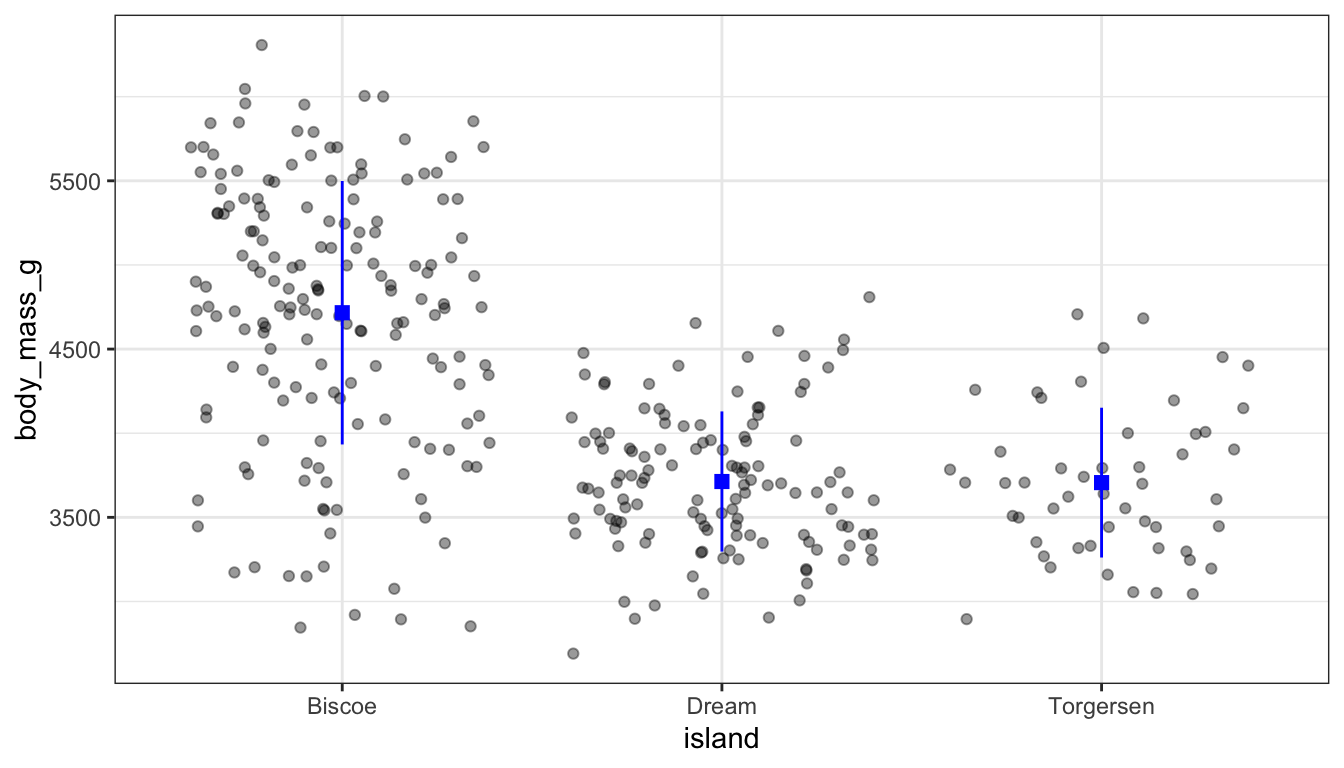
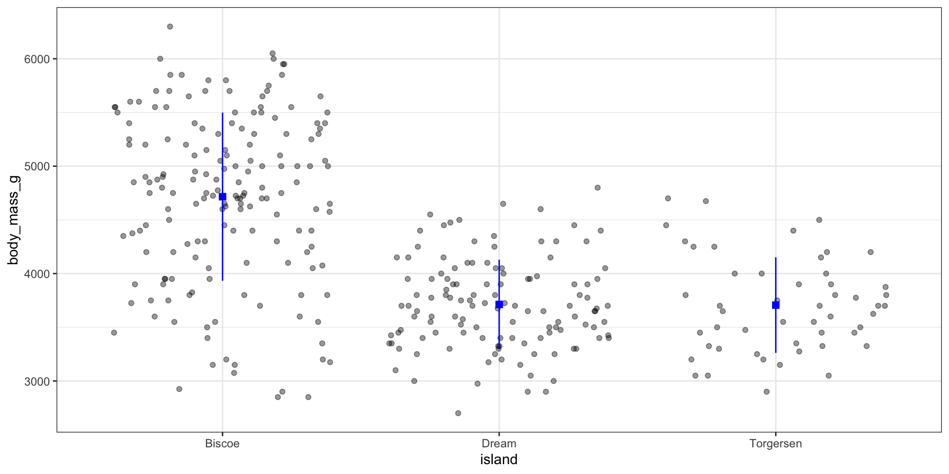
Data
Data is inherited from
ggplot()by all layers, but can be overridden for specific layersWorked example: jitter plot of raw data with mean ± standard deviation
library(tidyverse)
library(palmerpenguins)

#summarize dataset
peng_summary <-
  penguins |>
  group_by(island) |>
  summarize(
    mean_mass = mean(body_mass_g, na.rm = TRUE),
    lower_sd = mean_mass - sd(body_mass_g, na.rm = TRUE),
    upper_sd = mean_mass + sd(body_mass_g, na.rm = TRUE)
  )

ggplot(peng_summary, aes(x = island, y = mean_mass)) +
  #mean
  geom_point(shape = "square", color = "blue", size = 2.5) +
  #sd
  geom_errorbar(
    data = peng_summary,
    aes(y = mean_mass, ymin = lower_sd, ymax = upper_sd),
    width = 0.1,
    color = "blue"
  ) +
  #add raw data:
  geom_jitter(
    data = penguins,
    aes(y = body_mass_g),
    alpha = 0.4,
    height = 0
  )
Aesthetic mappings supplied to ggplot() are inherited, aesthetic mappings supplied to a geom only affect that geom.
Caution
With great power, comes great responsibility! It’s not always a good idea to map data to aesthetics just because you can. Stay tuned for part 2 of this series for more!
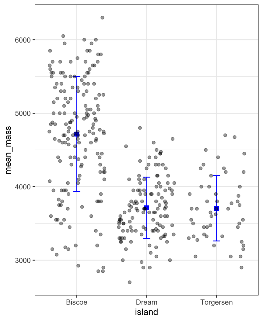
stat_summary()
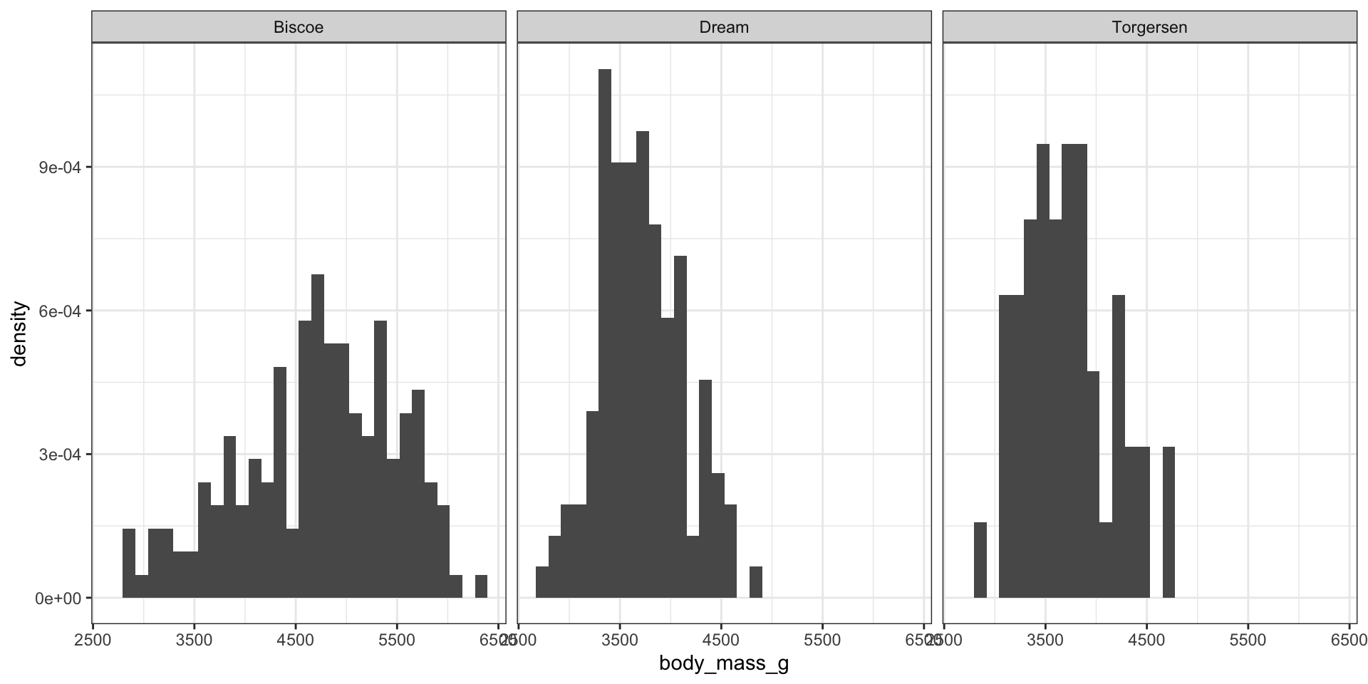
Binned density plot with geom_histogram() and after_stat()
Setting axis limits in scale_x_continuous() removes data that is out of range
`geom_smooth()` using formula = 'y ~ x'Warning: Removed 222 rows containing non-finite outside the scale range
(`stat_smooth()`).Warning: Removed 222 rows containing missing values or values outside the scale range
(`geom_point()`).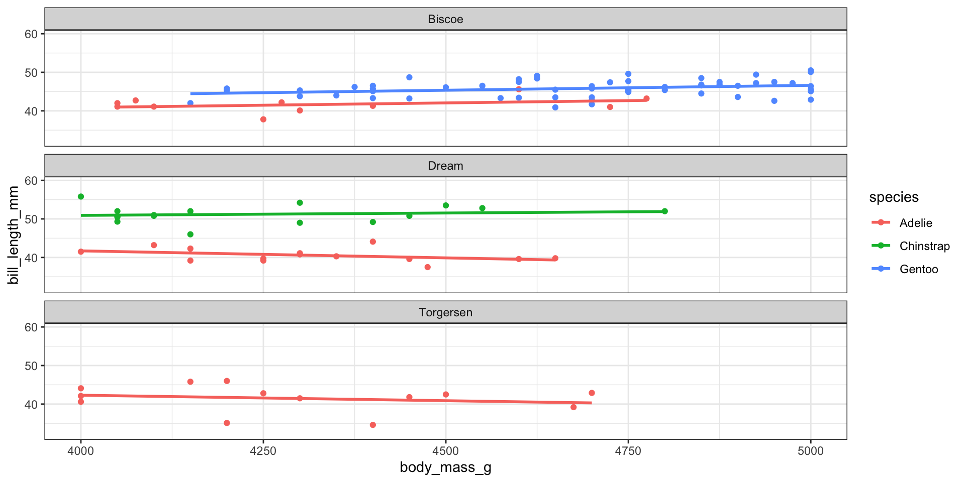
Setting axis limits in coord_cartesian() simply zooms in