library(ggplot2)
library(palmerpenguins) #for example dataset
library(patchwork) #for multi-panel figures
library(gridGraphics) #for combining ggplot2 and base R figures
library(gganimate) #for animated plots
library(ggdist) #for showing distributions + uncertainty in data
library(dplyr) #for cleaning data
library(ggraph) #for network dataExploring the Wide World of ggplot2 Extensions
2024-06-20
General-use and modular
“All-in-one” functions
Transformative & field-specific
patchwork
patchwork allows you to compose multi-panel figures with ease
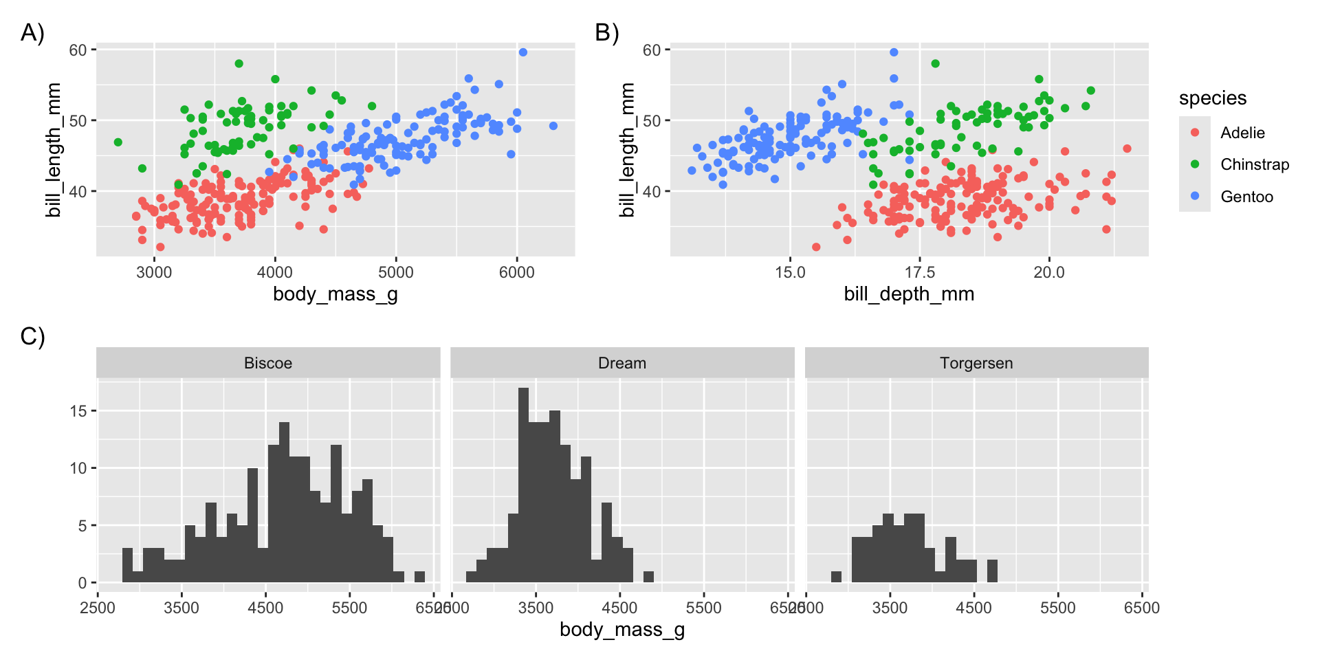
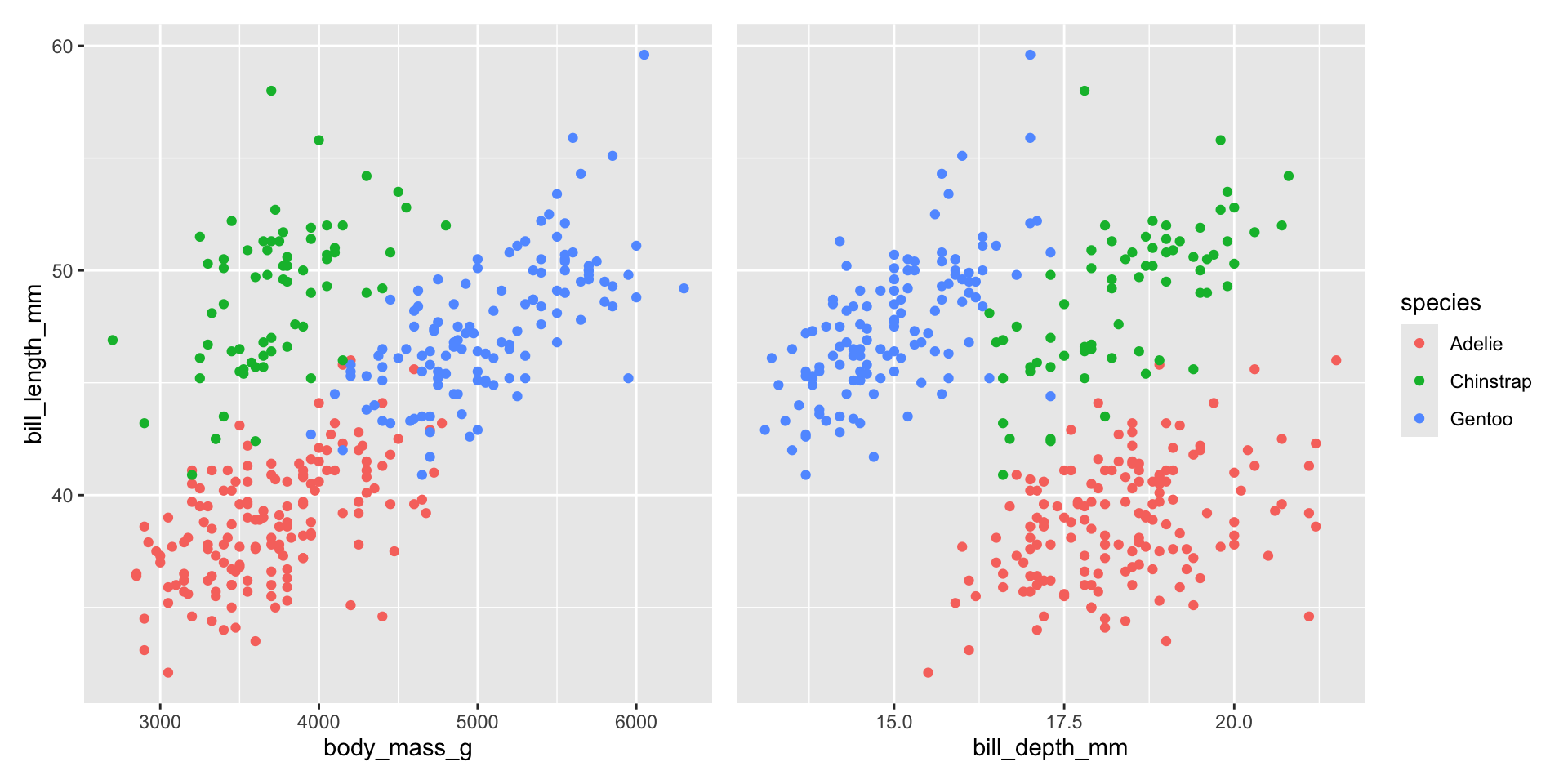
Combine plots
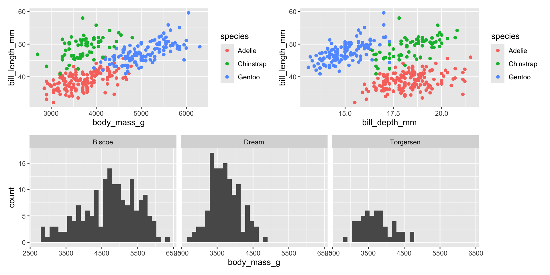
Combine guides
If plots have identical guides, you can combine them with plot_layout(guides = "collect")
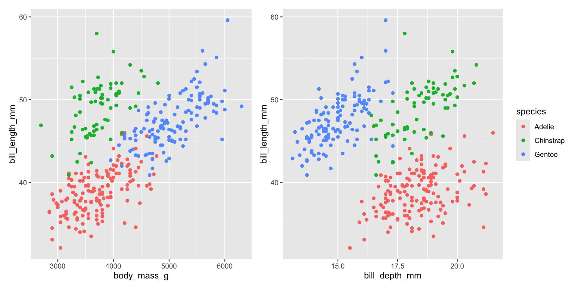
Combining axes
As of the most recent version of patchwork (v1.2.0) you can also combine identical axes.
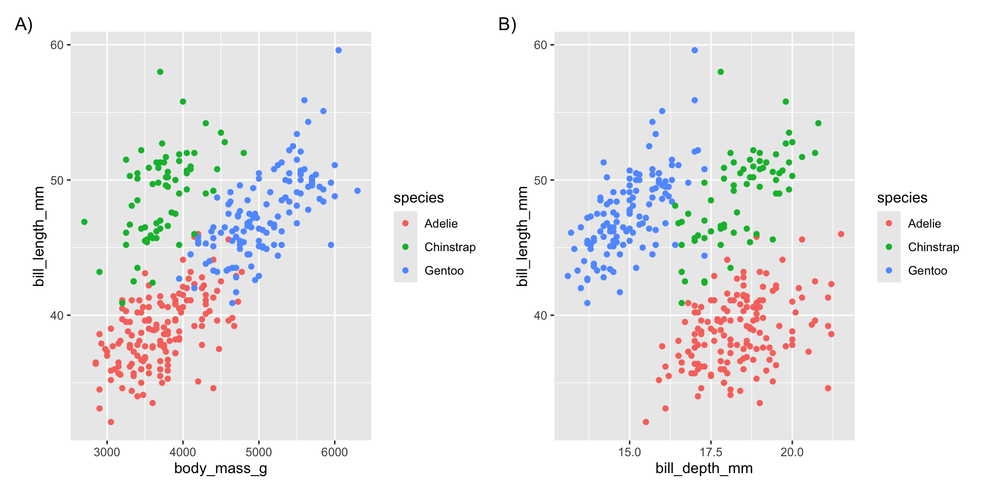
Tags
You can add “tags” to each panel with plot_annotation()
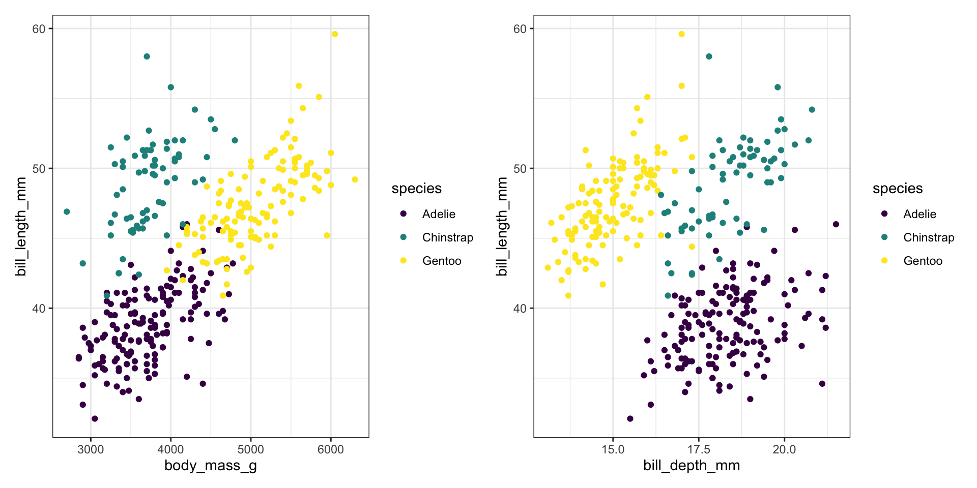
Modifying all panels
You can use the & operator instead of + to modify all elements of a multi-panel figure.
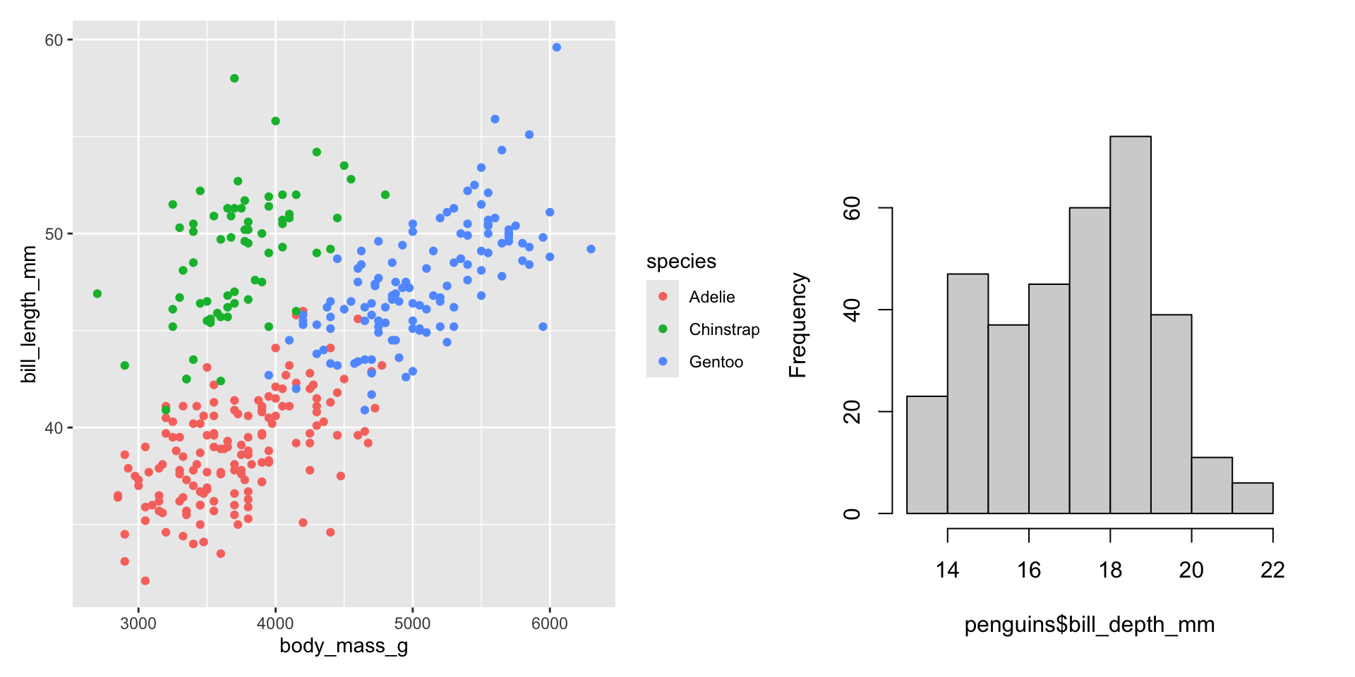
Using with base R plots
You can even combine ggplot2 plots with base R plots with a special syntax
Example
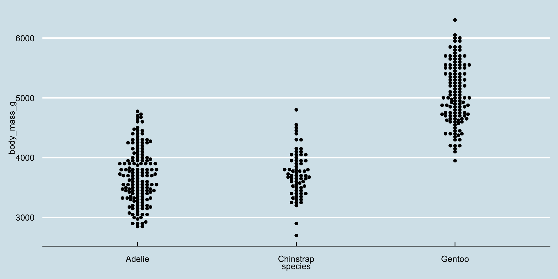
Body size distribution of penguins changing over the years
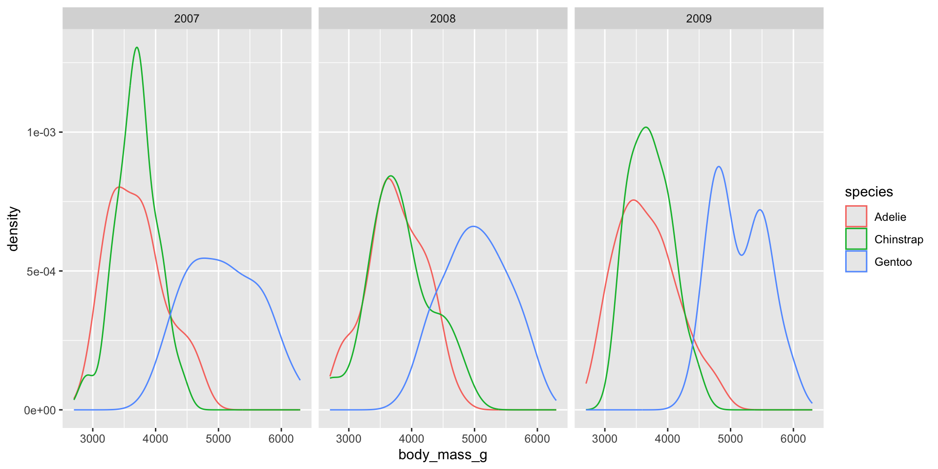
Show annual transition

Add history
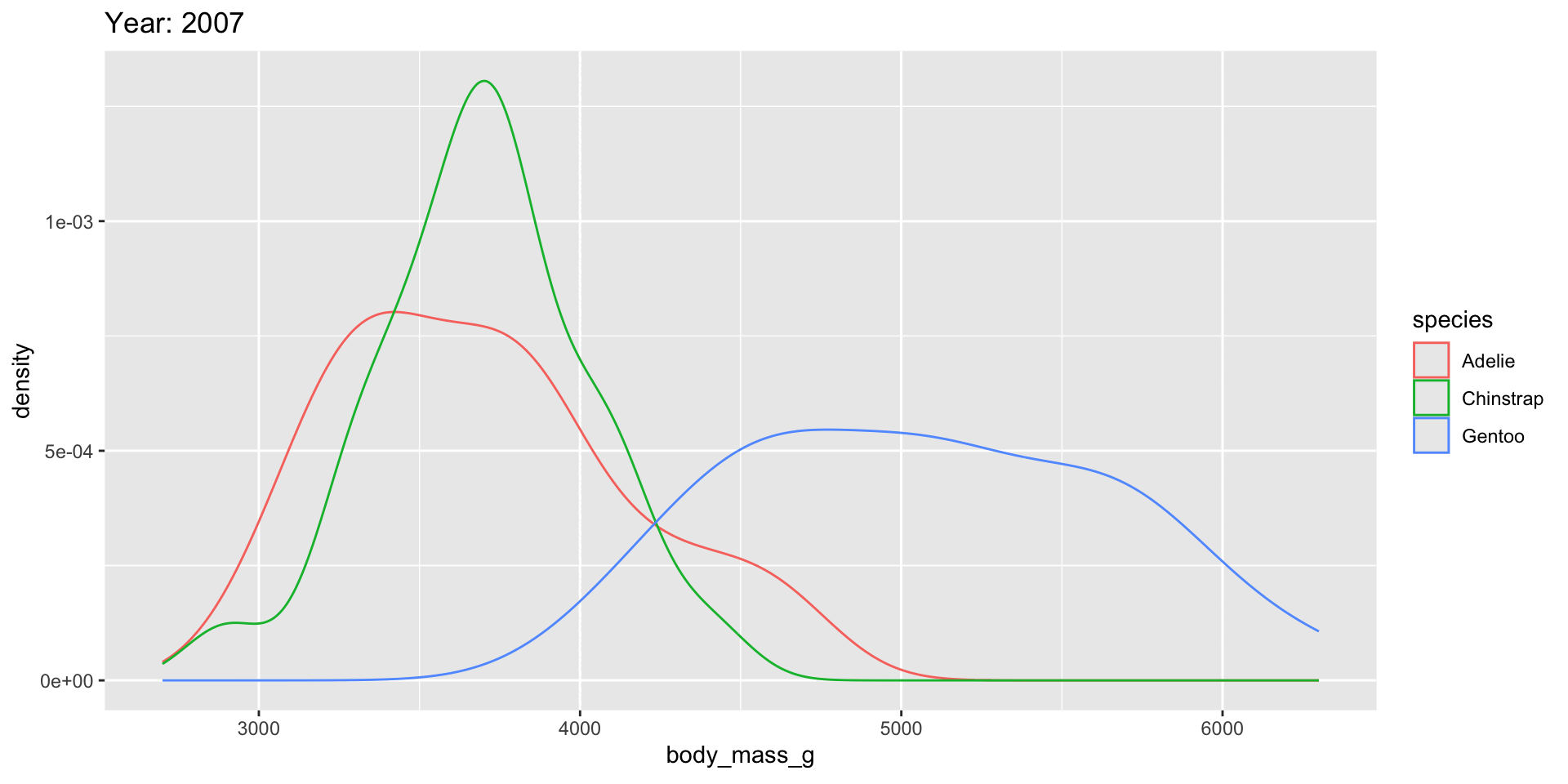
Modify transition speed

Have axes follow data

slabinterval
Example: dotsinterval
Example: interval
Example: interval

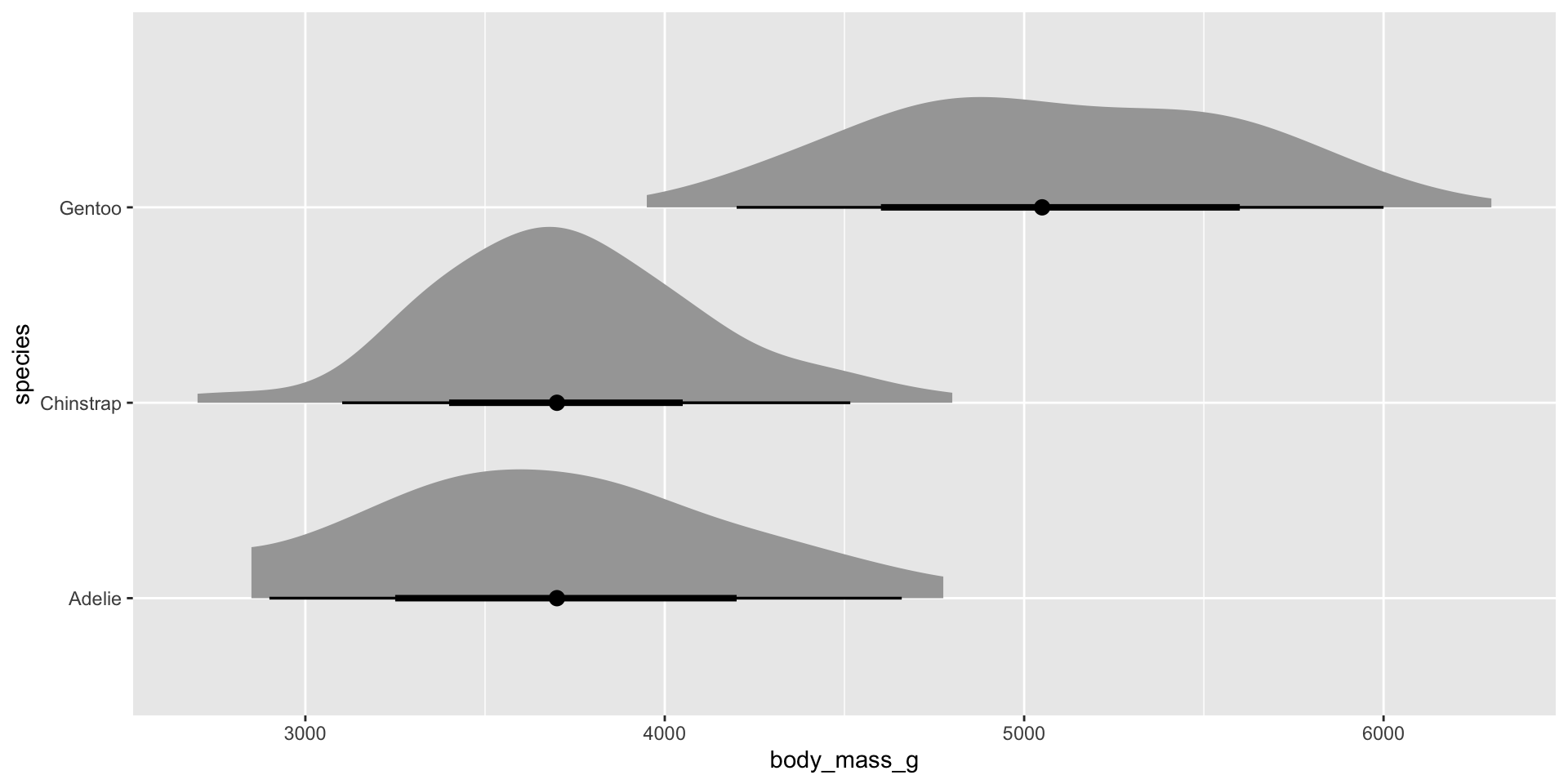
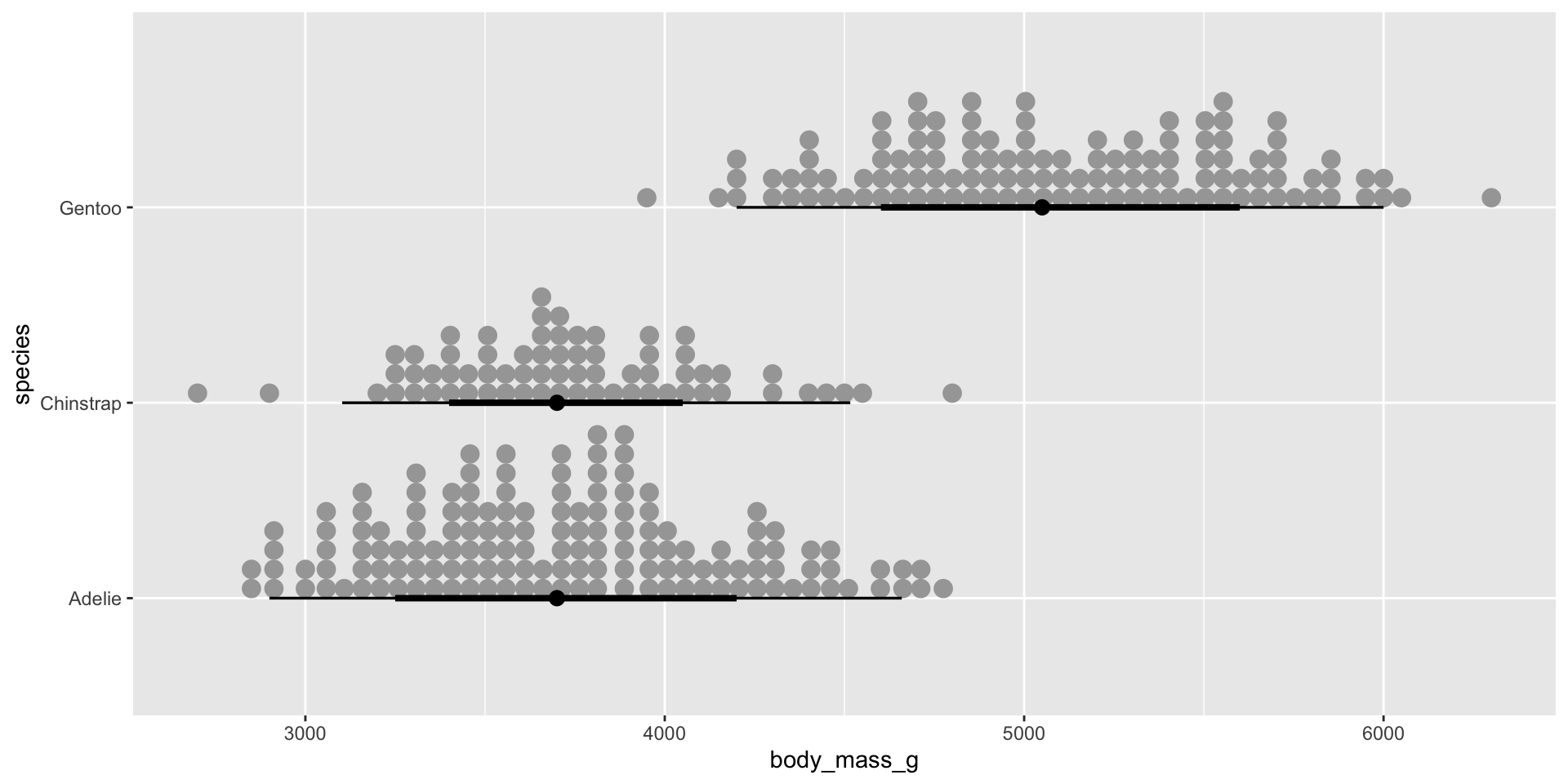
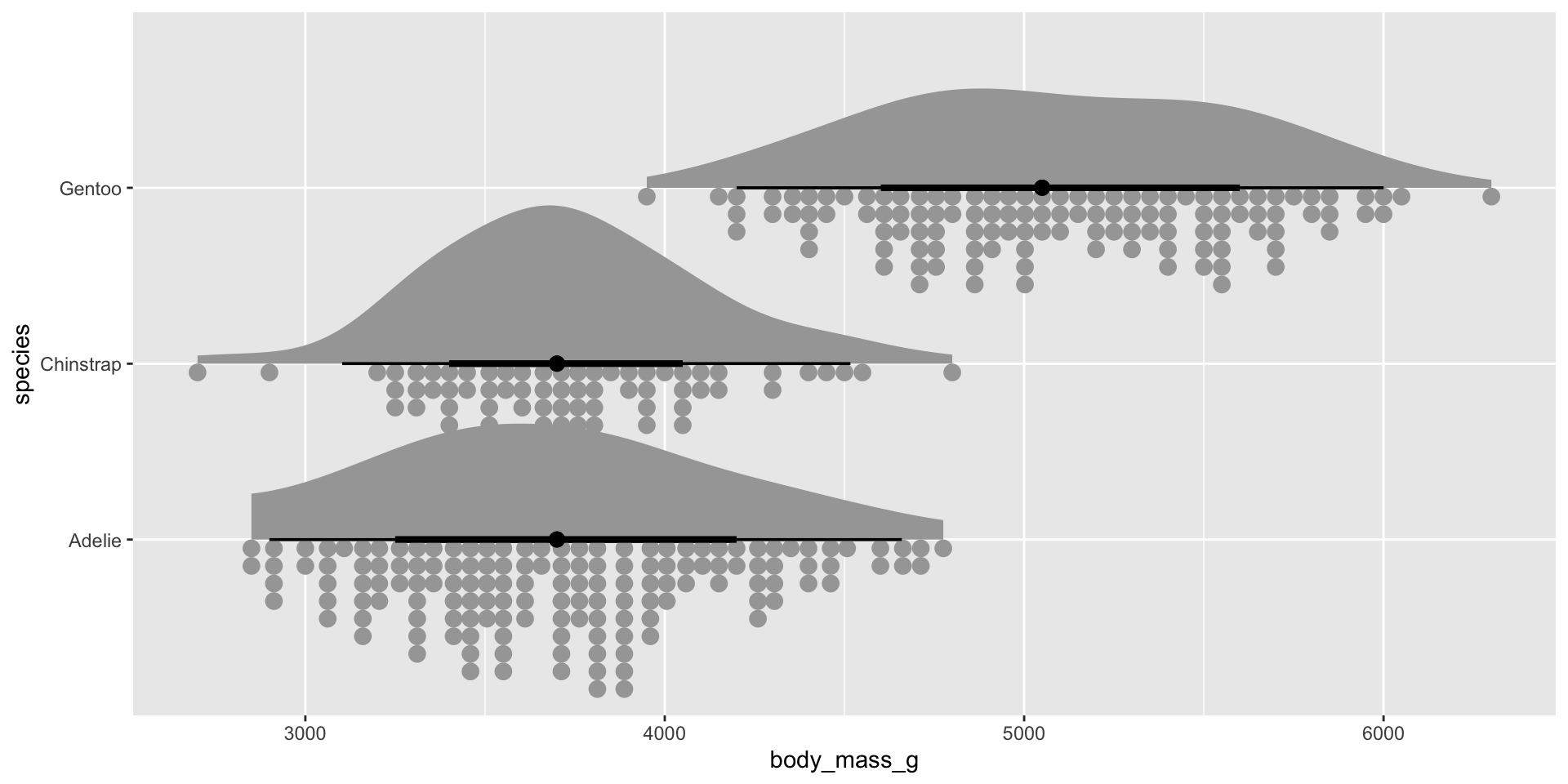
Combining elements: Raincloud plots
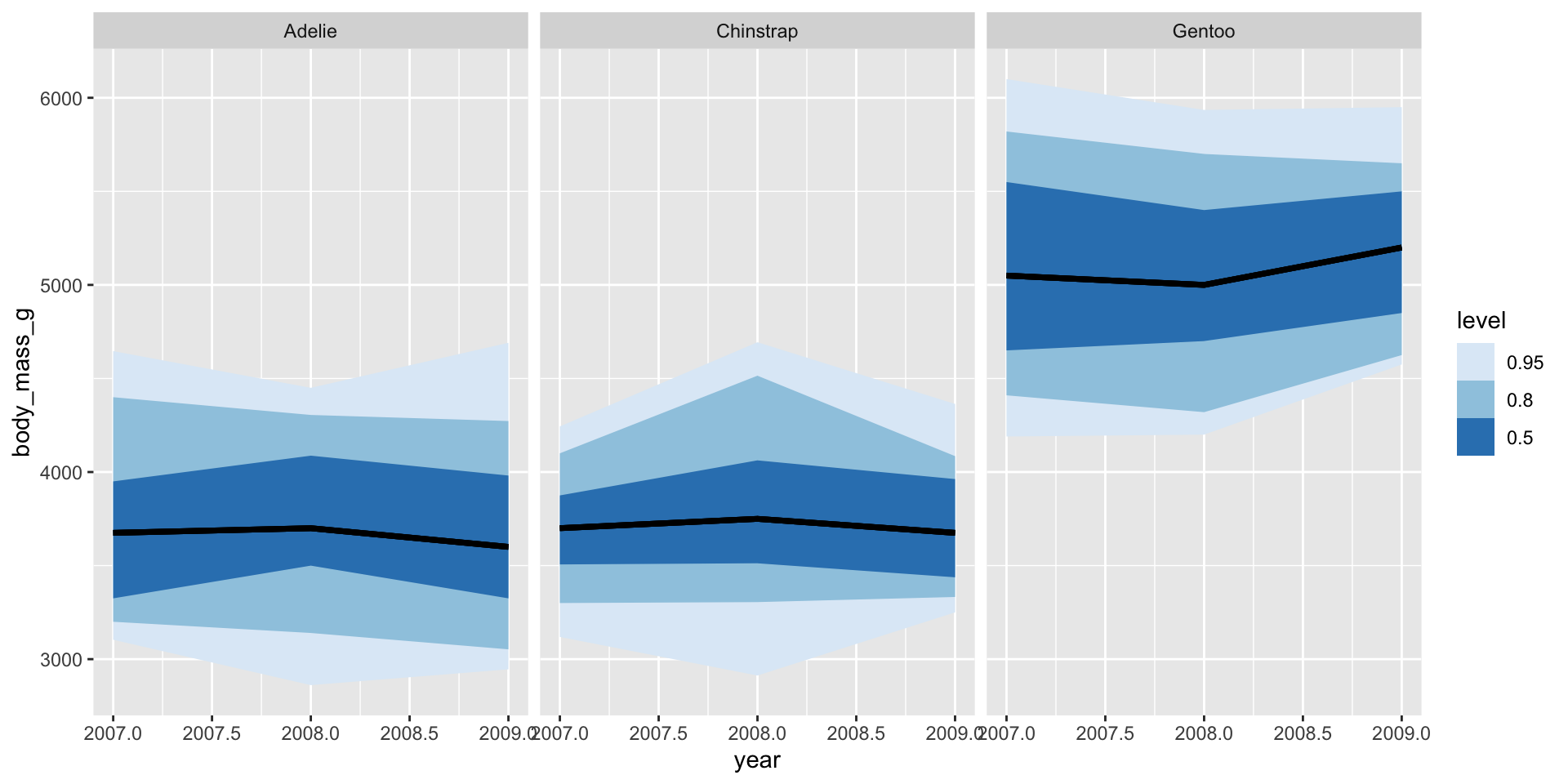
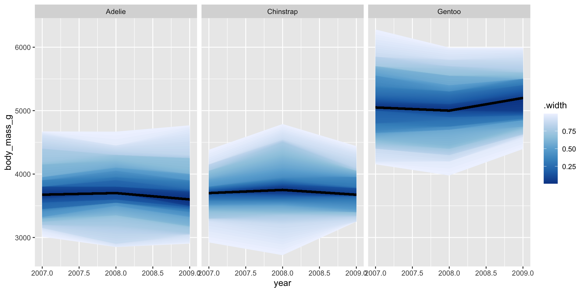
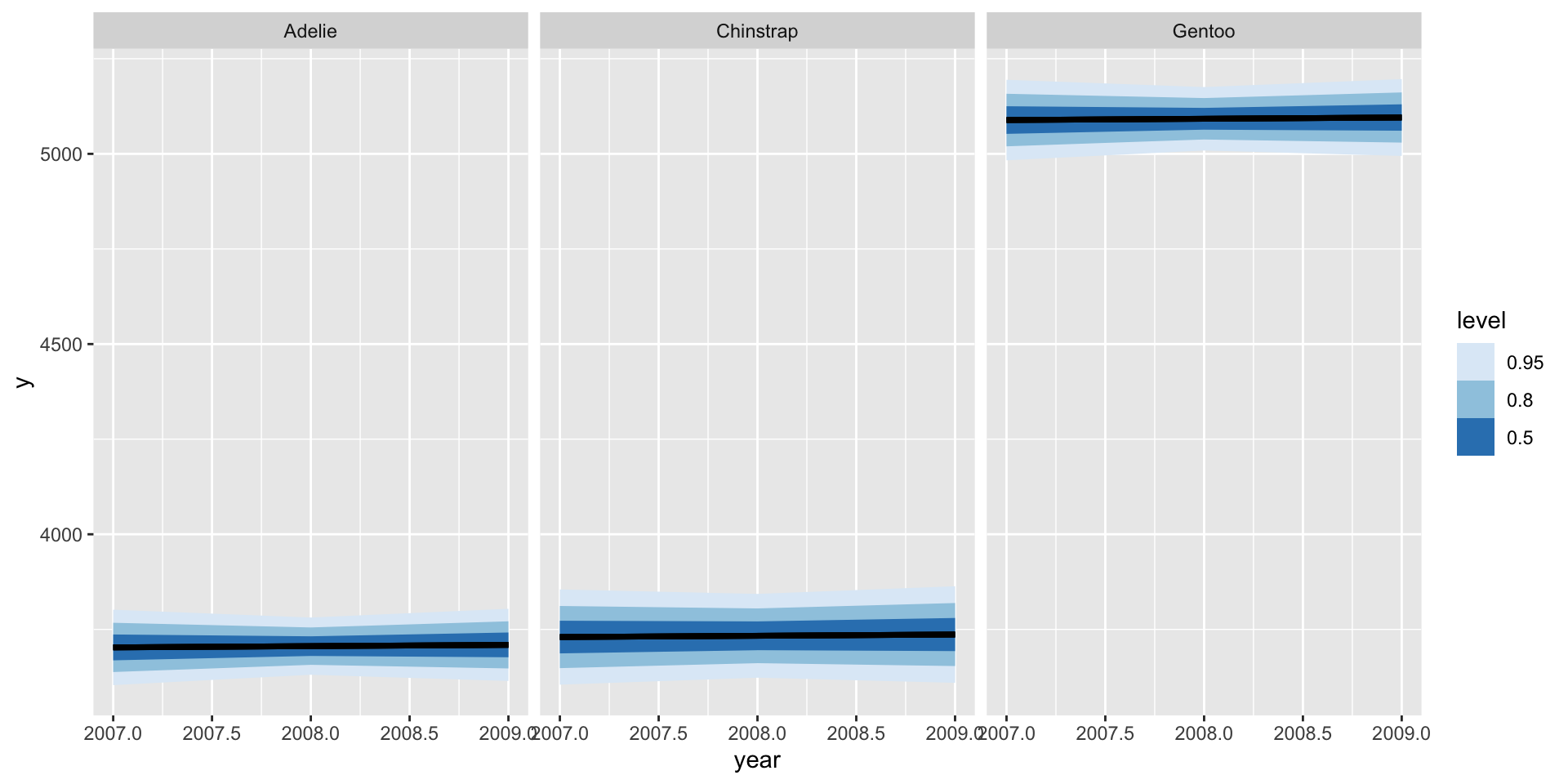
Ribbon plots
stat_lineribbon plots quantile intervals around a line automatically:
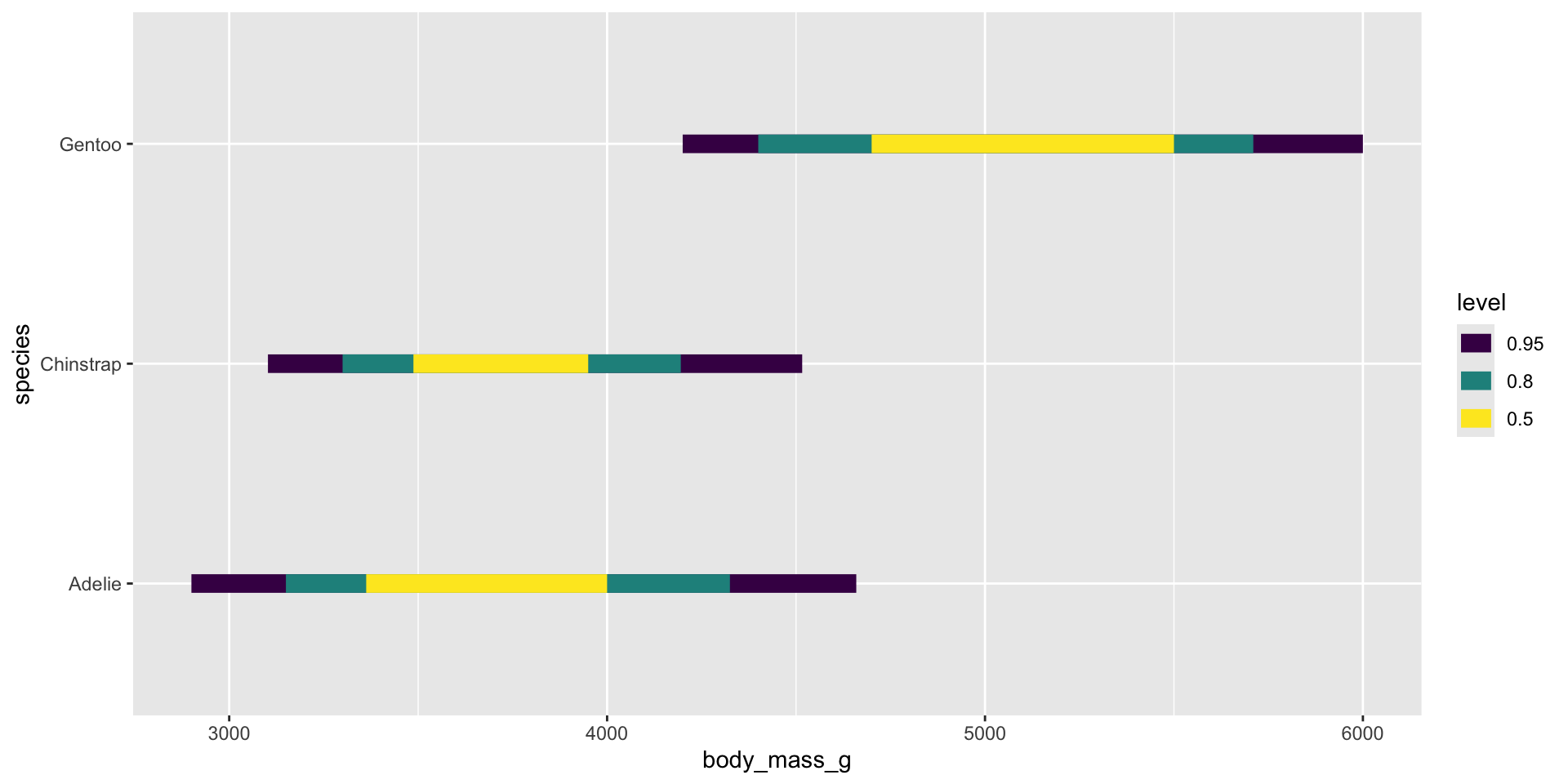
Ribbon plots
You can control the bands using the .width argument:
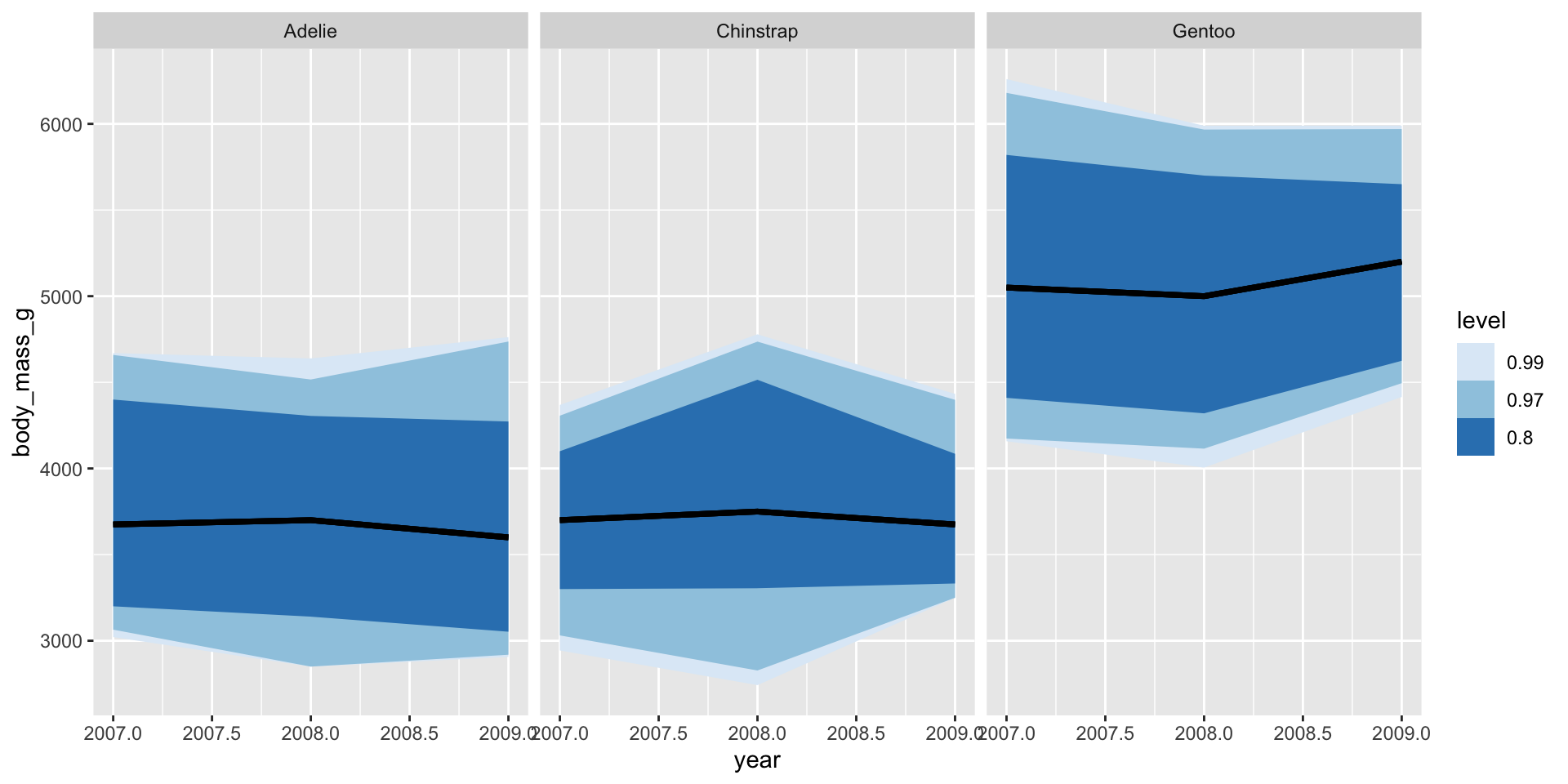
Ribbon plots
.width = ppoints() creates a gradient:
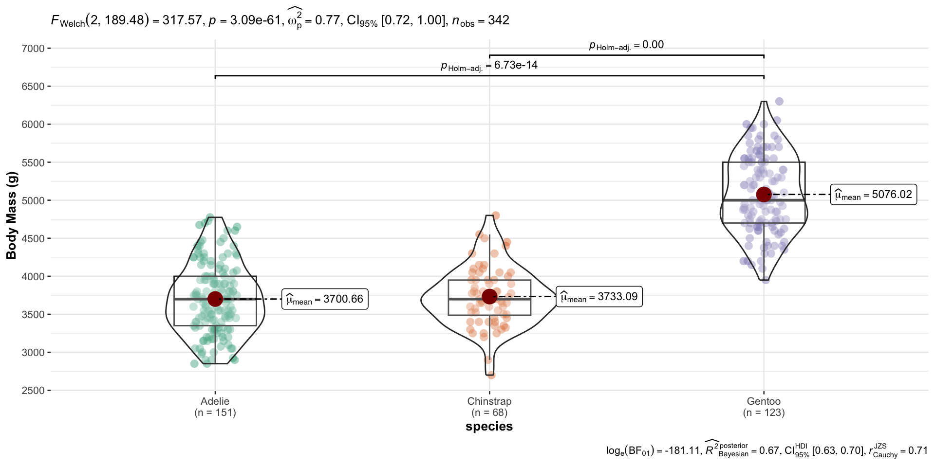
Visualizing frequentist model output
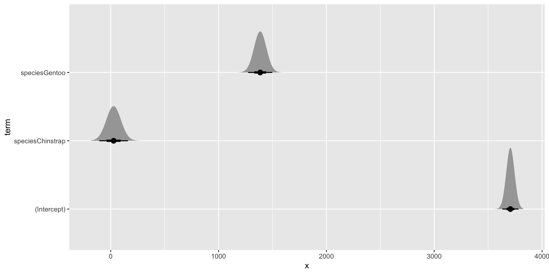
Visualizing frequentist model output
Posterior draws rainclouds
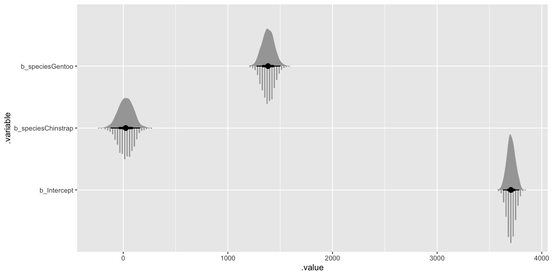
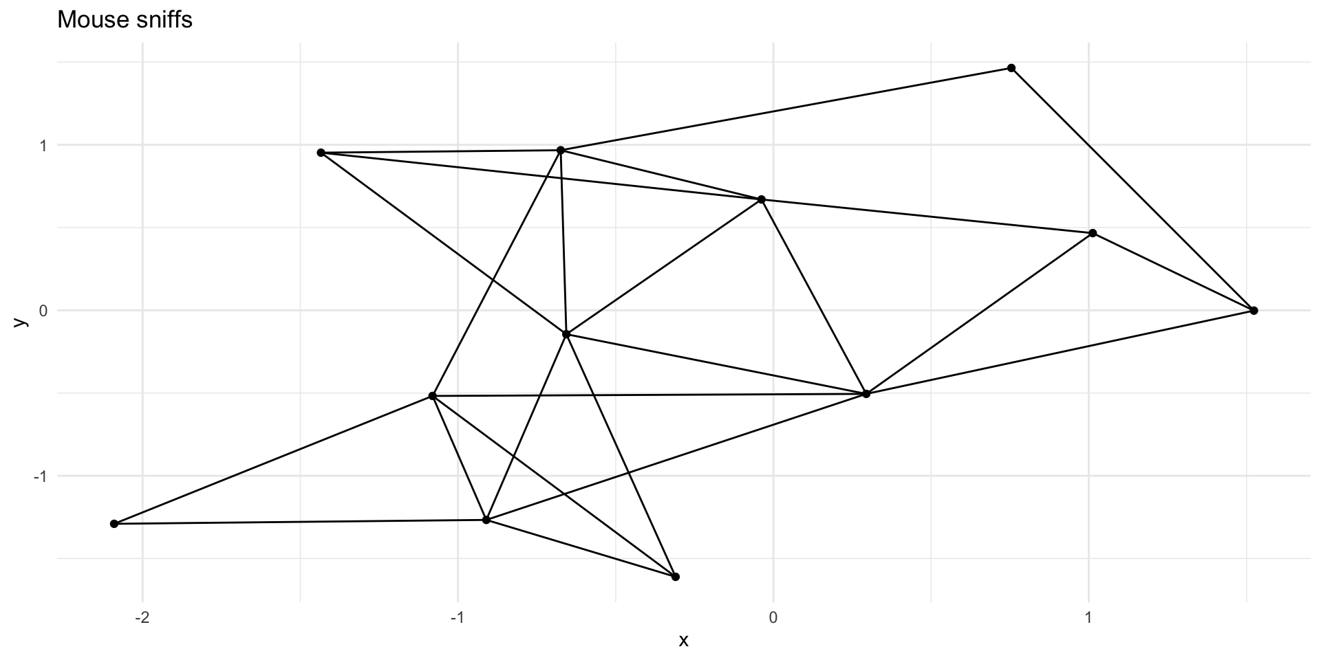
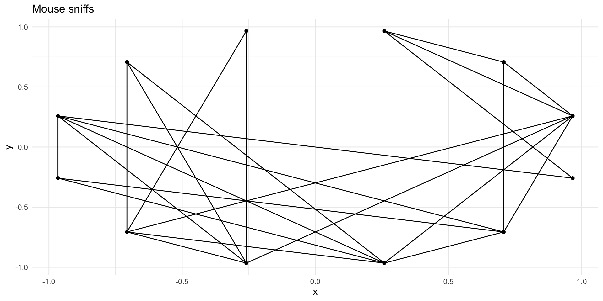
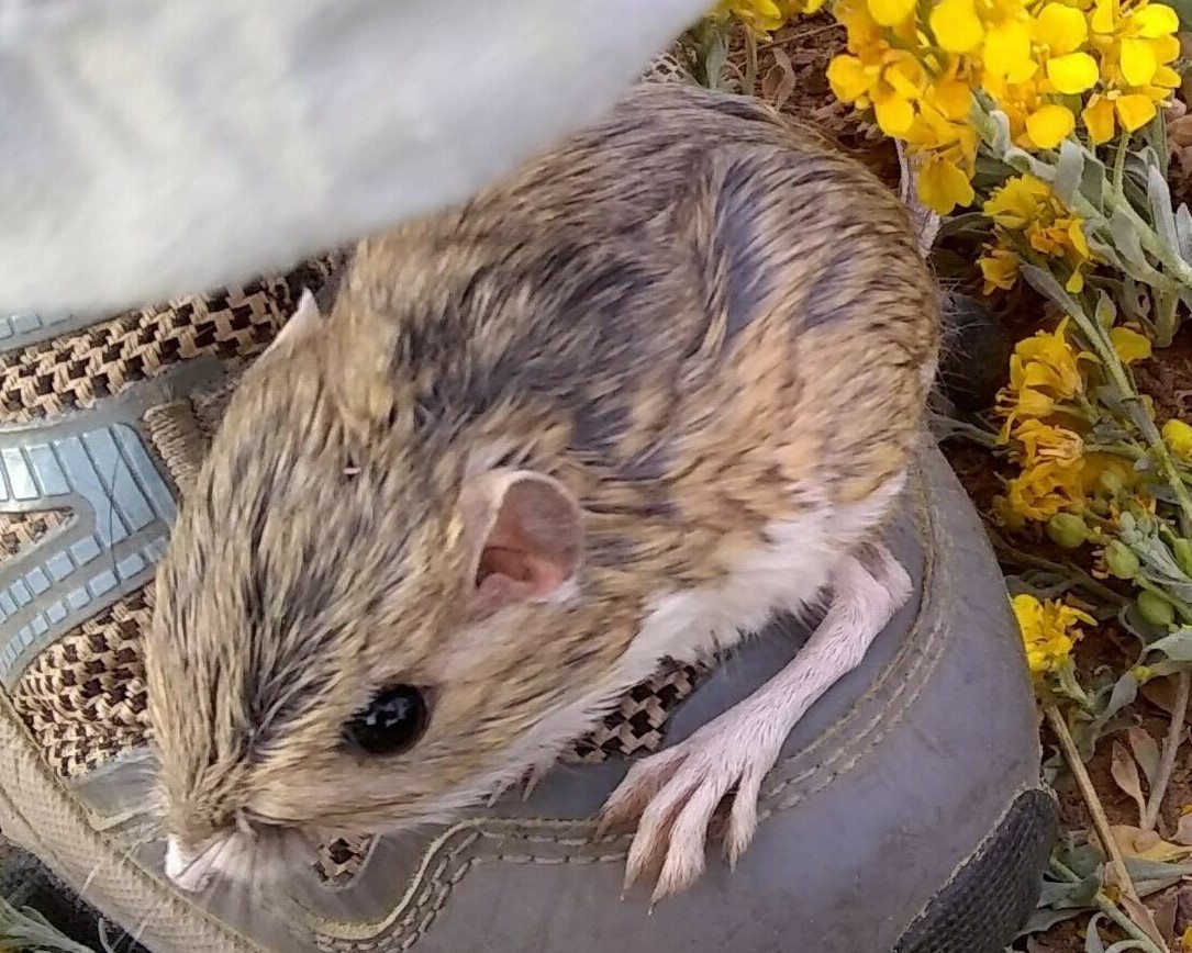
Plotting mouse sniffing data
Alternate layouts
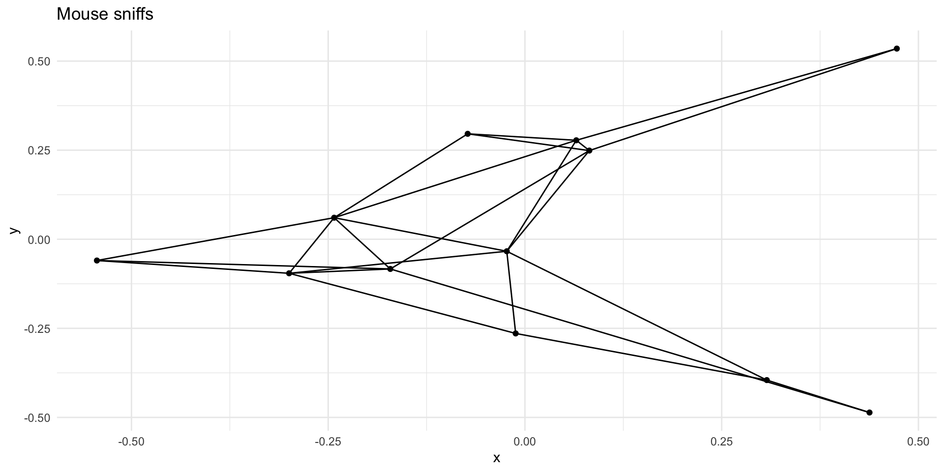
Alternate layouts
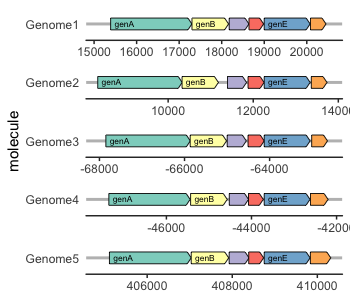
Getting a phylogeny
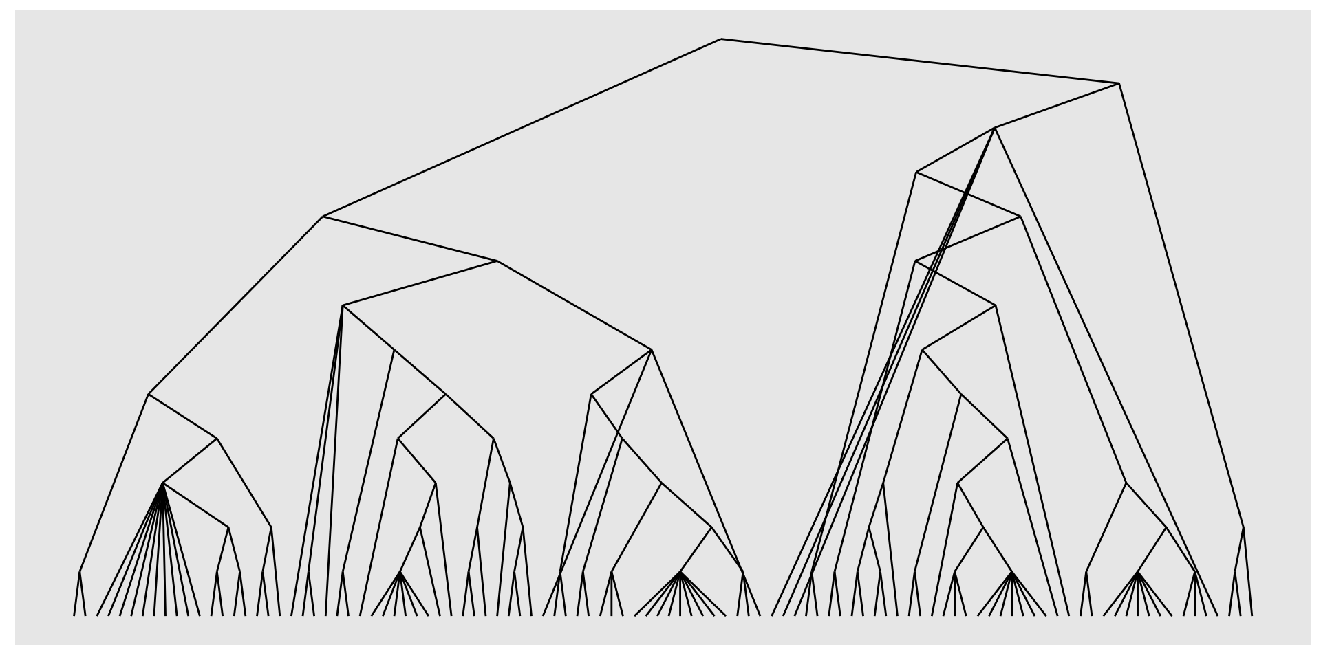
Dendrogram
Unrooted tree